Pages

Thursday, March 23, 2023

AECP - Seasonal Scene Building


Wow! Today's post is a celebration of sorts. I've completed the last of the ten courses for Level One of Altenew Academy's AECP. The last class was a jam-packed technique extravaganza taught by Nichol Magouirk. She has many innovative ideas about ways to build a scene on a card. It really was a worthwhile class and is probably my favorite out of all of the Level One classes.


Window Scene

For this project, I was inspired by a mash-up of some of Nichol's ideas. Cutting a window out of white cardstock and inking it made a great frame for whatever images would be placed in the four spots. I opted for my favorite real-life flower, a rose. The rose image uses a two-step stamping technique that is very simple to execute.

Stamping

All of the roses and the sentiment were stamped with permanent black ink. The color for each rose is the second layer of the stamp image. It was fun choosing a variety of colors. They are all listed below. However, any color will work well! The sentiment is from the same Life is Beautiful stamp set. I believe this stamp and die set is now retired.


The sepals and stems are colored with Altenew's B815, B802, and B635 alcohol markers. The window frame is popped off the black cardstock.  Then the unit adhered to a white cardstock base. By using a thick glue dot for each rose, I was able to place a stem underneath the bloom and tuck them under the window frame. The frame was outlined with silver foil tape to dress it up a bit. The finishing touch was using a white gel pen to add some marks to the black cardstock and roses. Kind of like a splatter effect without the splattering.

Thank you for viewing my progress through the classes. Maybe you will be inspired to try some of the techniques, too? Or, if you'd like - there are some free classes on the Altenew Academy website. You can enroll and try them at your leisure. 

THIS POST MAY CONTAIN AFFILIATE LINKS. BY CLICKING ON THEM AND PURCHASING PRODUCTS THROUGH MY LINKS, I RECEIVE A SMALL COMMISSION FOR THE REFERRAL. THE ITEM WILL NOT COST YOU ANY MORE BY GOING THROUGH THIS LINK.


Products Used:
Life is Beautiful Stamp and Die Set


Wednesday, March 22, 2023

AECP - Irresistible Inking Techniques


The latest class projects are inspired by Altenew Academy's AECP - Irresistible Inking Techniques course taught by Sara Naumann. The two cards shown here have center panels that use the masking technique to ink a background.

Masking Technique

Taylored Expressions makes a Mini Slim Masking Stencil with an inside and outer part to isolate either a solid rectangle in the center or to create an outside border. I used the mask that looks like a border to add color to only the inside part of the die-cut panel. The panel was cut with Taylored Expressions Stitched Mini Slim Stacklets.


Ink Blending

With the mask taped over the die-cut panel, I used Almond Butter Crisp dye ink for the card which has a kraft cardstock base. The light blue panel was colored with Misty Morning Crisp dye ink. Both cards used a blending brush for applying the ink directly from the ink pads. I also applied ink to the sentiment strip which has the word 'sending' stamped upon it.


Stamping Techniques

The Blooming Branches stamp set has an elegant branch with an additional layering stamp to create blooms. The branch can be used alone as shown stamped on the kraft background with Almond Butter ink. The pop of color that the blooms offer can be customized to whatever color palette you prefer. For both cards, the focus panel uses Milk Chocolate for the branch and Burnt Red for the blooms. It is very easy to align the blooms up with the branch to achieve a pretty layered stamped image. These were then die-cut using the coordinating die. The "sending love" sentiment comes from the same stamp set. The sentiment on the kraft card is from the Life is Beautiful stamp set.


THIS POST MAY CONTAIN AFFILIATE LINKS. BY CLICKING ON THEM AND PURCHASING PRODUCTS THROUGH MY LINKS, I RECEIVE A SMALL COMMISSION FOR THE REFERRAL. THE ITEM WILL NOT COST YOU ANY MORE BY GOING THROUGH THIS LINK.


Products Used:
Life is Beautiful Stamp Set

Tuesday, March 21, 2023

AECP - Let It Shine


Carissa Wiley teaches the AECP Let It Shine class for the Altenew Academy. It was a class filled with many different techniques for adding sparkle to cards. This class is one of the ten required classes for the Altenew Education Certification Level One Program. It has been my favorite thus far because it is all about adding shine and sparkle to cards from a teacher who really loves adding some glam to her projects. 


Inlaid Die Cutting
This card was inspired by Carissa's use of specialty papers to add shine to her cards. I enjoy doing inlaid die cutting and wanted to use some of Altenew's glitter cardstock in some of the cut-outs of the Simple Shapes cover die. I also wanted to use some bright colors to help showcase the 'hello' sentiment. Coloring individual pieces is very quick and easy.


Random pieces were colored with the following Copic colors: RV06, R27, YR09, Y08, YG07, B04, and B28. B28 is darker than the other hues so it was only used once. A piece of vellum placed over it helped tone it down and also gave a nice backdrop to the sentiment. Ink blending would also achieve a similar effect. However, I am a messy ink blender and the tiny pieces seemed like a recipe for inky fingers. Alternatively, I could have ink blended the cardstock prior to die cutting. My Copics have been neglected for awhile so it was nice to get them out for a bit to play.


A note about the Circled Greetings die - it is intended to be used as a cut-out rather than a stand-alone die cut. In order to cut it out as I have used it, I used the Hero Arts Nesting Circle Infinity die set. The third largest die is what gave a thicker border around the hello.

THIS POST MAY CONTAIN AFFILIATE LINKS. BY CLICKING ON THEM AND PURCHASING PRODUCTS THROUGH MY LINKS, I RECEIVE A SMALL COMMISSION FOR THE REFERRAL. THE ITEM WILL NOT COST YOU ANY MORE BY GOING THROUGH THIS LINK.


Products Used:

Copic Markers are available here:


Monday, March 20, 2023

AECP - All About Layering Four


Today's post is about layered stamping with floral designs from Altenew. I'm more than halfway through Level One of the AECP courses. The latest class that inspired this post is All About Layering Four. There are many different stamp sets from which to choose but the layering genius behind them is the same. Line up the images based on the guidelines provided on the packaging or downloaded from Altenew's website and create lovely flowers with depth and detail. 

Ink-blended background with white splatters

Tip for easy stamping

Using a stamp positioner makes lining up the stamps very easy. It allows for precise placement and also gives you repeatability for well-stamped images. I placed a piece of white cardstock in my Misti and stamped both flowers and the leaves at the same time. It was easy to swap out the stamps for each layer. On one set of flowers I used the same ink color for layers one and two, and on the second set used the darkest color twice for layers three and four. It is ok to use as many or as few colors as you like even though there are four layers.


Something was missing in the upper right corner but another flower made it seem too heavy. As butterflies are light, this seemed like a good addition to the sequins and Gelly Roll highlights. The little butterfly is a Martha Stewart punch.

THIS POST MAY CONTAIN AFFILIATE LINKS. BY CLICKING ON THEM AND PURCHASING PRODUCTS THROUGH MY LINKS, I RECEIVE A SMALL COMMISSION FOR THE REFERRAL. THE ITEM WILL NOT COST YOU ANY MORE BY GOING THROUGH THIS LINK.


Products Used:


Sunday, March 19, 2023

AECP - Clean & Simple Boutique Cards


Background from negative cuts

Today's card is very simple in execution but is easy to do. The inspiration for it is from the AECP course Clean & Simple Boutique Cards. Simple cards are usually quick to make. That doesn't mean that aesthetics aren't considered, though!  

Glue on each piece while on Press and Seal


With this card, I used Press and Seal wrap to hold the negative pieces, from the cover die, in place. I placed a bit of glue on every piece and then adhered them to some colored cardstock.


The sentiment came from the Dahlia Blossoms stamp set. The die cuts for the sentiment are from Spellbinder's Essential collection.  The sequins are from CTMH

The cover die cut under the card - to be used on another project
 

THIS POST MAY CONTAIN AFFILIATE LINKS. BY CLICKING ON THEM AND PURCHASING PRODUCTS THROUGH MY LINKS, I RECEIVE A SMALL COMMISSION FOR THE REFERRAL. THE ITEM WILL NOT COST YOU ANY MORE BY GOING THROUGH THIS LINK.


Products Used:

Layered Floral Cover Die A

Dahlia Blossoms Stamp Set

Permanent Black Ink

Spellbinders Essential Four Petal Labels set


Saturday, March 18, 2023

AECP - All About Layering Three Course Altenew Academy


Hello! I've been having fun pulling out older stamp sets and supplies and playing with them to complete the assignments for Altenew's AECP courses. Today's class is All About Layering Three. Lydia taught many ways to use the layered stamps for which Altenew is famous. The stamps and matching dies used on these cards are from the Dahlia Blossoms sets.  

Sakura Gelly Roll pen highlights
The background was created using outline stamps for the large and medium blooms. The images were randomly stamped with Grey Denim ink. The die-cut blossoms and leaves were stamped in layers using a light and dark color combination and also the outline stamps, this time in black. The 'sending hugs' die is from CTMH. The grey centers to the e, d, and g are the remnants from making a faux shadow layer.


The second card uses the same Dahlia Blossoms set. The background is the Layered Floral Cover Die A ink blended and adhered to a white card base. The Sending Hugs sentiment is from the Strength Blooms stamp set.


Tomorrow's card will be a Clean and Simple design. Please stop by to see another fairly easy card.


THIS POST MAY CONTAIN AFFILIATE LINKS. BY CLICKING ON THEM AND PURCHASING PRODUCTS THROUGH MY LINKS, I RECEIVE A SMALL COMMISSION FOR THE REFERRAL. THE ITEM WILL NOT COST YOU ANY MORE BY GOING THROUGH THIS LINK.


Products Used:


Friday, March 17, 2023

AECP - For The Guys


The latest Altenew Academy class that I've completed is about making masculine cards. The course is called For the Guys. Making cards for men is always a little bit challenging for me. Clean and simple cards seem to lend themselves to a more masculine feel. With that in mind, here is my latest project for  AECP certification consideration.

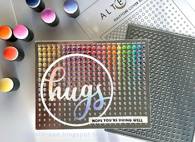
The cover die cut out of silver cardstock lends an industrial vibe to the card. Black was an easy choice to go with it. This is a very simple card but definitely works for the requirement to make a masculine card. The only thing I hesitated about was the inclusion of the 'hugs' die. It is a bit fancier than I may have chosen but I love the circle around the word. It mimics all of the tiny circles in the background.


THIS POST MAY CONTAIN AFFILIATE LINKS. BY CLICKING ON THEM AND PURCHASING PRODUCTS THROUGH MY LINKS, I RECEIVE A SMALL COMMISSION FOR THE REFERRAL. THE ITEM WILL NOT COST YOU ANY MORE BY GOING THROUGH THIS LINK.

Thursday, March 16, 2023

AECP Easy Die Cutting Techniques


Hello! Today's post is inspired by the Altenew Academy's Easy Die Cutting Techniques course taught by Yana Smakula. The last two blog posts also included die-cutting elements but this one will show an additional way to use die cuts. 


Inlaid die cut and popped up die cut in white

Inlaid Die Cuts

This is a fun way to expand your die cuts, especially background or cover plate dies. You can vary the inlay depth by choosing to pop up the negative cuts or inlay them like tilework. 


The first card is watercolor paper painted with reinkers. I have a lot of reinkers! And this is another way to use products from my stash. The colors used are mainly discontinued Close To My Heart colors and a couple of PinkFresh Studio ones, as well. The white cube pieces are glued on top of the watercolored pieces and reinserted into the cover die-cut piece. I wanted the 'love' to show up well, so underneath the word are the original pieces placed back into the die.
Radial Hearts Cover Die Inlaid Technique

The base layer of this card is die-cut with all of the pieces replaced. After adhering them into place, I ink-blended the base.  Cutting the teal paper with the die allowed a lot of flexibility in how many pieces to use to adhere on top of the base. It also allowed for three of the hearts to be glued onto the top of the circle around the sentiment. The card base could have been made by embossing the die cut instead of cutting out the base layer. I rarely pre-plan my cards and layouts so that did not occur to me until the card was almost completed.


Inlaid die-cutting
The "love" circle is part of a set from Taylored Expressions. The circle part is cut from the word on the liquid watercolor/reinker card.


THIS POST MAY CONTAIN AFFILIATE LINKS. BY CLICKING ON THEM AND PURCHASING PRODUCTS THROUGH MY LINKS, I RECEIVE A SMALL COMMISSION FOR THE REFERRAL. THE ITEM WILL NOT COST YOU ANY MORE BY GOING THROUGH THIS LINK.


Products Used:


Wednesday, March 15, 2023

AECP Easy Ink Blending Course


AECP Second Submission

The Easy Ink Blending Course taught through Altenew Academy by Amy Lee was a fun journey visiting some favorite techniques. I chose to focus on the lesson showcasing ink-blended backgrounds. It never fails to impress when a plain piece of cardstock transforms into a colorful backdrop. 


The first example is made on a panel for a slimline card. Slimline cards vary in size. What they have in common is that they will fit into a legal-sized envelope. This card measures 8.5" x 3.5". The inked panel is 3.25" x 8.25". 


What is ink blending?

Even though I started with a white piece of 110 lb cardstock, ink blending can be done on any type and color of cardstock or paper. As long as it hasn't been coated. The only tools needed are some type of applicator, such as a blending brush or dauber and your chosen ink colors.  A large brush is faster for larger and open areas. I'm trying to use up a large supply so I used both brushes and daubers. The little circles pictured above are from the daubers. This is fine because it blends out with more ink applied on top. Dye and hybrid inks work very well for this technique. Pigment inks will work but they are sticky. You can heat set in-between layers but then you don't get as nice of a blend. That being said, pigment inks or embossing inks can add a nice effect if you want to add embossing glitter or powder to your project. 

Adding dimension

After blending the background, I splattered rubbing alcohol using a toothbrush to give it little 'star shine' like areas. On top of that, I splattered white droplets using Dr. Ph. Martin's Bleedproof White and a small paintbrush.

The skyline is washi applied to a piece of cardstock, roughly fussy cut, and popped up over the background. The gold washi was applied to another piece of white cardstock covering about 2/3's of the piece. I die-cut the 'love" so that both the white and gold would be seen. This was also popped up with foam tape. If the washi doesn't want to stay adhered, use a little wet glue to keep it in place.


Sprinkling gold sequins on the card was the finishing touch. This is a quick and easy card that should not require additional postage when mailed.


Thank you for stopping by today as I continue with my Altenew Educator Certification Program classes and share my completed projects.

THIS POST MAY CONTAIN AFFILIATE LINKS. BY CLICKING ON THEM AND PURCHASING PRODUCTS THROUGH MY LINKS, I RECEIVE A SMALL COMMISSION FOR THE REFERRAL. THE ITEM WILL NOT COST YOU ANY MORE BY GOING THROUGH THIS LINK.


Products Used:


I mainly used the darkest colors of each of the ink bundles. The entire bundle isn't necessary to use for this particular background. Use what appeals to you.


Tuesday, March 14, 2023

Altenew's AECP Celebration Stencil Techniques


What is AECP?

AECP stands for Altenew Educator Certification Program. Even though I have been using Altenew products for many years, I decided to challenge myself by going through their certification program. This post was born out of the first class that I completed. The cards started from an idea based on Lesson One in the Celebration Stencil Techniques by Laurel Beard. 


The stencil used for the card below is under the silver cardstock cut from the same die


Altenew's Product Line

You have probably seen Altenew's gorgeous layered stamped images on Instagram and on many blogs, including this one! They are the company that made layered stamping popular because the results are always beautiful. Did you know they also have other paper crafting products to complement their stamps?

Stretching your supplies

Today, I want to share one of their cover dies - but used in a less traditional way. By cutting a piece of heavy cardstock or watercolor paper, you can make a stencil for ink blending, spraying, and water-coloring,  You use the die cut like you would with a mylar or plastic stencil. When you are done with it as a stencil you may be able to use it on a project, as well. The photo at the top of the post uses both the stencil and the stenciled panel. The stencil was moved over a little to create an interesting pattern.


Liquid watercolor on die-cut through to base cardstock

Thoughts about paper

Paper weight matters. The heavier the paper, the more robust the die cut will be. However, if it is very thick, you may need to run it through your die-cutting machine several times for a good cut. In the projects posted here, you will see 140 lb watercolor paper and 110 lb cardstock. If using gel or paste on the die cut to make a textured card, use the heaviest weight paper you can get through your die-cutter. 
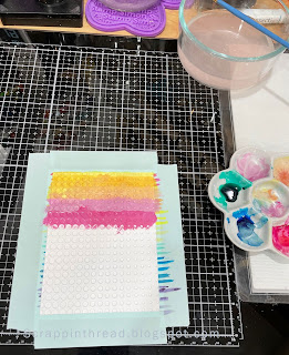

Watercolor mixed with gouache and applied to die-cut and base layer cardstock

Best choices for dies to use as stencils

Bold cover dies work very well. I tend to favor geometric designs for this technique. However, you can also use smaller die cuts as masks.  That is one of my favorite ways to use spray inks or mists. I love how the image is protected by the mask. Additionally, the intricacy of the die should also be considered. If you want to use a lot of wet media or are an aggressive blender, intricate dies may not give you the best results. But use what you have and experiment to find what works best for you.
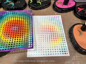
Ink-blended die-cut and base layer

Inks or Paints?

The media that you choose to use for your project will depend on a variety of things. Are you having a play to see how the product works? Are you making a card, painting on fabric, or working on an art journal? The application may dictate whether you use a paint with high viscosity or a very fluid ink spray. Or maybe you want to use watercolors or ink blending to achieve a certain lightness or intensity of color. Many times, I have an idea and start with it and then find that something more interesting presents itself.
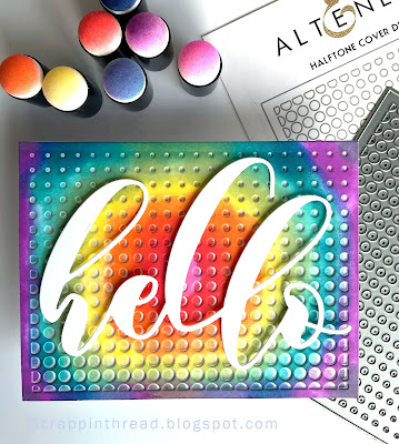
The stencil was offset on top of the stenciled panel
Close-ups


THIS POST MAY CONTAIN AFFILIATE LINKS. BY CLICKING ON THEM AND PURCHASING PRODUCTS THROUGH MY LINKS, I RECEIVE A SMALL COMMISSION FOR THE REFERRAL. THE ITEM WILL NOT COST YOU ANY MORE BY GOING THROUGH THIS LINK.

Products Used:

Circled Greetings: Hugs Die (this die does not cut the outer circle, it is intended to be used as a cutout)