Paper and Fiber Arts


Welcome to my mixed media blog. Thanks for stopping by.
Showing posts with label Pinkfresh Studio. Show all posts

Sunday, July 23, 2023

Stacked Stencils for Clean and Simple Cards

Have you layered stand-alone stencils to achieve a new look? That is what today's post is about. I used two stencils to create a different effect on three clean and simple cards. The idea is from Nicole Watt in her Altenew Academy class titled "Advanced Stencil Techniques". Her class is filled with a lot of fun techniques. This one particularly appeals to me because it looks great and is very fun to do. Also, I love that there is a bit of a surprise element to what you create that is shown upon the reveal. 

On the first two cards, I used the grid stencil after using an open stencil or mask for the first layer. The card pictured above is the maze stencil with Silver Sage ink blended onto a 4.25" x 5.5" piece of cardstock. Leaving the stencil in place, the grid stencil is aligned on top, and Pool and Navy inks are blended over the original design. The photo above shows the ink blending after that step with the grid stencil removed.
Clean and Simple Card with Stacked Stenciling

These next two cards use a reverse mask from the Wonderland set. The one above shows it with the grid stencil and the one below is with a discontinued geometric stencil. Also, the one below uses navy ink after the geometric design was complete. Each of the cards has a stamped sentiment from the Wonderland stamp set. 

All three cards are layered onto standard 4.25" x 5.5" card bases after die-cutting the stencil background and a frame using Gina K's Master Cuts Set 1 dies. A little bling was added to all of the cards using Pinkfresh Studio Metallic Pearls or Essential Jewels. 
The large die-cut sentiment is popped up with foam tape. It covers some of the card, but not enough to be distracting from the cool-looking background. I hope you give this technique a try! It is kind of addictive, though.


THIS POST MAY CONTAIN AFFILIATE LINKS. BY CLICKING ON THEM AND PURCHASING PRODUCTS THROUGH MY LINKS, I RECEIVE A SMALL COMMISSION FOR THE REFERRAL. THE ITEM WILL NOT COST YOU ANY MORE BY GOING THROUGH THIS LINK.


Products Used:

Thursday, July 13, 2023

Stenciling Two Ways For Beautiful Card Backgrounds


Both of the cards shown today are made using the same stencil and ink colors. By stenciling them two different ways, you can create interesting and beautiful card backgrounds. The first card is ink blended by holding the stencil in place and overlapping the ink. Because the colors are on the cool side of the color wheel, it almost makes an ombre effect. For true ombre you would just blend a little more to have more subtle gradation. 

After stenciling the 4.25" x 5.5" cardstock piece, I Zentangled the closed circles with a variety of shapes. This is a really fun technique. If you'd like to see another card made this way, visit here.

Even though it looks really cool as it is, I decided to use the negative cuts from the next card to create a circle around the black 'hello'. 

The sentiment is an inset circle shape that I cut out of the surrounding circle with scissors. This is then inset into the negative cutaway pieces of the other stenciled card which is shown below.

The last picture shows how I used the leftover ink on the ink blending brushes and the stencil which was turned 90 degrees after ink blending over the top of the cardstock as done on the first background. It made a great background for another card and there was no additional mess to clean afterwards!


Both card fronts were cut and layered using the two large dies from Gina K's Master Layouts 1 set. On the second card, the black piece is the smaller cut shape and layered under the stenciled piece to let the 'hello' be the focus. I used two nesting circle dies to make the black frame around the circle. The finishing touch is the little silver half pearls glued to the black cardstock under the 'hello' sentiment die cut.

THIS POST MAY CONTAIN AFFILIATE LINKS. BY CLICKING ON THEM AND PURCHASING PRODUCTS THROUGH MY LINKS, I RECEIVE A SMALL COMMISSION FOR THE REFERRAL. THE ITEM WILL NOT COST YOU ANY MORE BY GOING THROUGH THIS LINK.


Thursday, June 29, 2023

Venetian Neighborhood Using Three Different Coloring Techniques


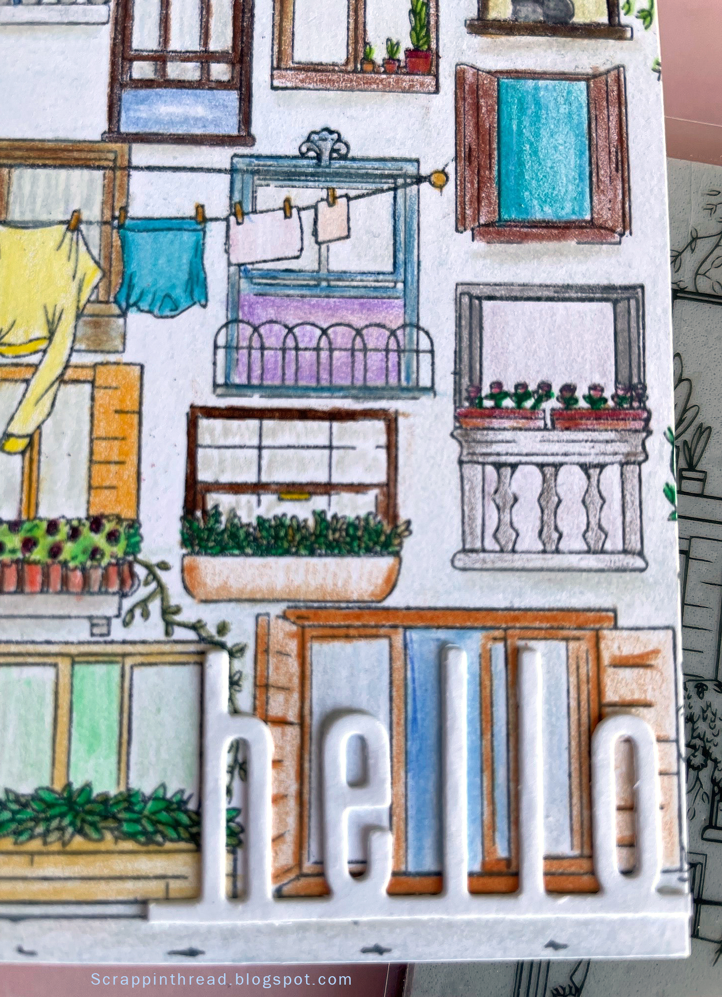
This Hero Arts stamp is an amazingly detailed large stamp that is perfect for many types of coloring techniques. I could have chosen more but stuck with three very different ones to showcase very different looks. And one of them is kind of a failure.


The stamped image is a Venetian neighborhood. I wanted something with an old-world, vintage vibe because Venice has an old-world charm.  And because Venice is known for its canals, the first choice was a water tie-in - watercolor.  This was done on dry paper. If it had been wet on wet, it would look different. Experimenting and playing are part of the process.


Using Prismacolor colored pencils to color this card front took a bit of time. Or it could be that I was coloring while watching tv and I am not as good at multi-tasking as I thought! Coloring can be as time-consuming as you'd like. Many times, I use Gamsol when using colored pencils to blend the color.  This time, I did not use anything to blend. It gives a more cartoony look to the card. That is ok because I wanted to use a very modern-looking Catherine Pooler 'hello" die cut.

Hero Arts Venetian Neighborhood Stamped Image

It is funny how the backdrop to the card can make the card appear to be a different shade. I'm showing both to let you see that photography can trick us into thinking something is not necessarily as it appears in real life. The background of the card is actually a very pale blush-tan color, not pink as it appears above.


The last card was an experiment. I debated showing it because it isn't what I normally want to show on here. But, it is important for me to remember that even 'failures' have merit. The lesson in this card is that tiny lines are difficult to color with pastels if you expect to stay inside the lines. The end result is very messy and sketchy. If that is the look you are after, great! Pastels are messy. They just are. Ultimately, I decided to embrace the mess and accept that this card gives an old-fashioned, found-this-in-an-attic-trunk kind of vibe. To fix the pastels, I used clear gesso. This made the cardstock curl. The front is glued to a side-folding 4.25" x 5.5" card base. The card base helps to tame the curl but, as you can see in the photo below, it still isn't flat.


Whatever materials you use to color your creations, enjoy the process and have fun!


THIS POST MAY CONTAIN AFFILIATE LINKS. BY CLICKING ON THEM AND PURCHASING PRODUCTS THROUGH MY LINKS, I RECEIVE A SMALL COMMISSION FOR THE REFERRAL. THE ITEM WILL NOT COST YOU ANY MORE BY GOING THROUGH THIS LINK.

Friday, June 23, 2023

Decorative Die - Three Cards


Hello! Today's post shows how to use one decorative die a bit differently for three beautiful, unique cards. The Decorative Enamels die set has two dies but each card is made with only one of them. This first card uses the large die.
  
Because the rainbow spectrum is always fun, I cut a bunch of die-cut shapes in many different colors. Bright colors look great on both black and white cardstock. Having the die-cuts extend off the black cardstock over the white card base offers more dimension and interest to the card. The layered sentiment is from a set of Pinkfresh Studio dies cut in black and white cardstock.


This elegant card is also made with the large die from the set. By using copper metallic cardstock as the background and repeating it for the top layer, it offers continuity.  There is a layer of vellum on top of the white die-cuts, which are layered onto the copper cardstock. The vellum mutes the brightness of the white cardstock. 
 

One way to make images stand out is to offset the design on top of another piece of cardstock in a contrasting color cut out with the same design die-cut. This is the technique used with the two copper die cuts that are the focal point of the card.


The last card is made with the small die in the set. Each of the cuts is a different color with the middle shape cut out of vellum. 


Adding a bit of bling to each of the shapes makes the card complete. The circles are Silver Glossy Dots from Pink and Main.


My goal of using craft supplies in as many ways as possible makes me happy. This die set allows for lots of variations. Check out this fourth card using the die set here.


THIS POST MAY CONTAIN AFFILIATE LINKS. BY CLICKING ON THEM AND PURCHASING PRODUCTS THROUGH MY LINKS, I RECEIVE A SMALL COMMISSION FOR THE REFERRAL. THE ITEM WILL NOT COST YOU ANY MORE BY GOING THROUGH THIS LINK.


Thursday, May 4, 2023

Craft My Stash: Reinker Marbling with Altenew, Pinkfresh, CTMH, Gina K., Ranger Inks

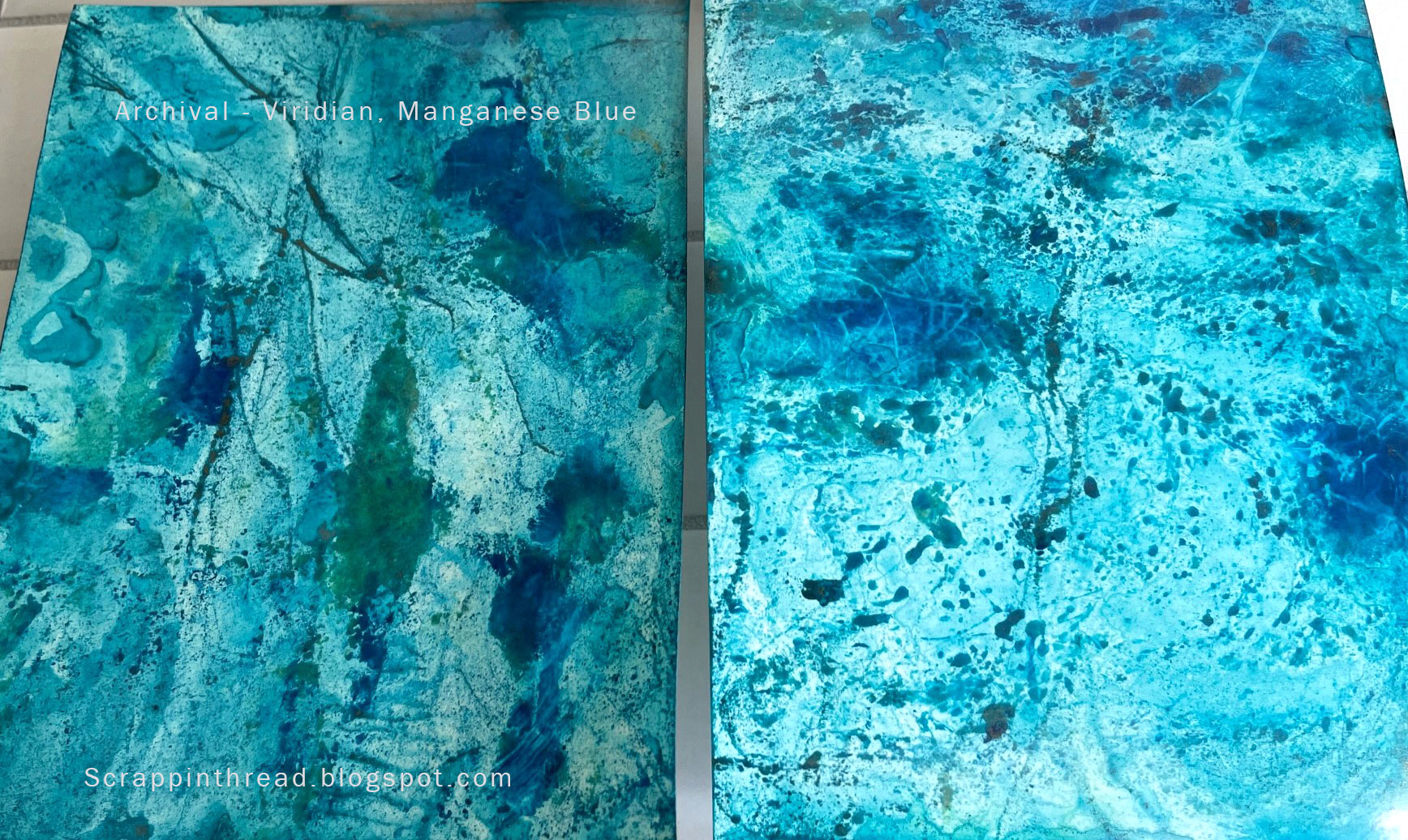
All of the re-inkers were used with photo paper and glossy cardstock. The colors are listed below with their respective photos. For the faux marbling technique, please watch the video tutorial. The paper was sprayed with water prior to applying the inks and additional water. The gold pigment ink pad is no longer available but other metallic pigment inks should work in a very similar manner. 

Glossy Cardstock is on the left-hand side of each picture posted below. The photo paper is on the right.

Altenew Reinkers

  1. Citrus Burst
  2. Snapdragon
  3. Grass Field


Paper after placed in an embossing folder

Archival Reinkers

  1. Manganese Blue
  2. Viridian

CTMH

  1. Thistle
  2. Crystal Blue
  3. Spring Iris


Tim Holtz Distress Ink

  1. Mustard Seed
  2. Tattered Rose
  3. Broken China


Distress Oxide

  1. Salvaged Patina
  2. Kitsch Flamingo

Gina K Designs

  1. Tangerine Twist
  2. Barely There
  3. Soft Stone


Pinkfresh Studio

  1. Persimmon
  2. Marigold
  3. Sky Blue


THIS POST MAY CONTAIN AFFILIATE LINKS. BY CLICKING ON THEM AND PURCHASING PRODUCTS THROUGH MY LINKS, I RECEIVE A SMALL COMMISSION FOR THE REFERRAL. THE ITEM WILL NOT COST YOU ANY MORE BY GOING THROUGH THIS LINK.


Products Used: