Paper and Fiber Arts


Welcome to my mixed media blog. Thanks for stopping by.
Showing posts with label Altenew. Show all posts

Saturday, July 29, 2023

Elements of Floral Composition


One of the Altenew Academy classes that I recently completed has to do with the elements of design. The class is taught by Jaycee Gaspar. He is an Altenew Design Team Member, as well as an Altenew educator. Jaycee makes beautiful cards using watercolor with stamped floral images. His work is gorgeous! I took this class because I admire his work and wanted to know more about his process. These two clean and simple cards reflect some of what I learned in this class.  The first card showcases the use of line as a design element. 

Line

The heavier weight of a brush marker line as a frame around the circle gives additional emphasis to what is included in the flat frame. Even though nothing on the card front is popped off the surface, the thicker line also helps to make the circle seem three-dimensional. The only dimension on the card front is the use of sequins and pearls. Once the card front was complete, it was popped off the 4.25" x 5.5" base with a black die-cut frame underneath. The front and frame were cut with Gina K Designs Master Layouts 1 set. 

The petals of the flower almost cradle the sentiment. Perceived lines in linear composition help with the placement of elements, such as sentiments, on a card. All images are stamped from the Build-A-Flower: Laelia set. First, the card panel was ink blended with Pool ink using a circle mask. This created a focal point for the black outline stamp to rest. One of the layering stamps was used to add a little bit of color, also using Pool ink. There are additional layering stamps in the set. However, I like the graphic look of limiting how much color is on this card. The next card uses the same inks, masks, and stamp set but in a different way.


Shape

Both cards use the circle as a design element but in a reverse way. There is no actual dimension on this card. The leaves are contained within the circle. The images are stamped on the A2 card base after ink-blending the center section of the masked card. Perceived depth and dimension are achieved by the use of the dark center color. This is especially useful in creating flat cards for mailing. Additional interest is added with ink splatters of the Pool ink mixed with a bit of water.

THIS POST MAY CONTAIN AFFILIATE LINKS. BY CLICKING ON THEM AND PURCHASING PRODUCTS THROUGH MY LINKS, I RECEIVE A SMALL COMMISSION FOR THE REFERRAL. THE ITEM WILL NOT COST YOU ANY MORE BY GOING THROUGH THIS LINK.


Thursday, July 27, 2023

Watercolor Takes Practice


Recently, I completed two Altenew Academy classes on watercolor for card makers. After viewing the two different instructors' creations, the main takeaway is that watercolor takes practice. In my case, a lot of practice! The workshops are titled Botanical Illustration Inspired Watercolor, taught by Jaycee Gaspar, and Artists' Watercolor 101 for Paper Crafters with Emily Midgett. Each instructor has their own style, but both agreed that swatching your paints beforehand is a good idea.


It is time-consuming to swatch things. But the effort is worth it. The picture, above, shows the Altenew Essentials Pan set along with the painted piece of watercolor paper with each of the colors painted on it. There are swatches of each color mixed with the other colors, as well. I swatch all of my paints, inks, markers, embossing powders, and punches. It helps to have all of these things as a reference. Some of them I refer to more than others - but all of them provide me with an opportunity to see how the product works with the papers I use.

The card featured today shows the large rose and some of the foliage from the Tranquility Rose Stamp set stamped (and masked) onto watercolor paper with a light gray color. The use of the Silver Lake ink creates a no-line coloring image. This means that when the rose is painted, the lines fade into the image and are not very noticeable. For a true no-line watercolor, it is best to use the same color ink, when stamping, as will be used in painting. I didn't decide to go with yellow until after stamping so the stamped ink is faintly visible. After the watercolor dried, the panel was cut with a GinaK Designs frame and mounted onto a gray card front measuring 4.25" x 5.5". The sentiments come from the same Tranquility Rose stamp set. These are stamped with Obsidian Pigment ink. The butterflies are stamped with the same ink and heat embossed with clear powder. After coloring the images with Copic markers, they are popped up with foam. A few sequins complete the front panel. 

THIS POST MAY CONTAIN AFFILIATE LINKS. BY CLICKING ON THEM AND PURCHASING PRODUCTS THROUGH MY LINKS, I RECEIVE A SMALL COMMISSION FOR THE REFERRAL. THE ITEM WILL NOT COST YOU ANY MORE BY GOING THROUGH THIS LINK.


Altenew - Clear Photopolymer Stamps - Tranquility Rose
Scrapbook.com

Gina K Designs - Dies - Master Layouts 01
Scrapbook.com

Master Layouts Dies - Gina K. Website

Sunday, July 23, 2023

Stacked Stencils for Clean and Simple Cards

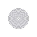
Have you layered stand-alone stencils to achieve a new look? That is what today's post is about. I used two stencils to create a different effect on three clean and simple cards. The idea is from Nicole Watt in her Altenew Academy class titled "Advanced Stencil Techniques". Her class is filled with a lot of fun techniques. This one particularly appeals to me because it looks great and is very fun to do. Also, I love that there is a bit of a surprise element to what you create that is shown upon the reveal. 

On the first two cards, I used the grid stencil after using an open stencil or mask for the first layer. The card pictured above is the maze stencil with Silver Sage ink blended onto a 4.25" x 5.5" piece of cardstock. Leaving the stencil in place, the grid stencil is aligned on top, and Pool and Navy inks are blended over the original design. The photo above shows the ink blending after that step with the grid stencil removed.
Clean and Simple Card with Stacked Stenciling

These next two cards use a reverse mask from the Wonderland set. The one above shows it with the grid stencil and the one below is with a discontinued geometric stencil. Also, the one below uses navy ink after the geometric design was complete. Each of the cards has a stamped sentiment from the Wonderland stamp set. 

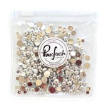
All three cards are layered onto standard 4.25" x 5.5" card bases after die-cutting the stencil background and a frame using Gina K's Master Cuts Set 1 dies. A little bling was added to all of the cards using Pinkfresh Studio Metallic Pearls or Essential Jewels. 
The large die-cut sentiment is popped up with foam tape. It covers some of the card, but not enough to be distracting from the cool-looking background. I hope you give this technique a try! It is kind of addictive, though.


THIS POST MAY CONTAIN AFFILIATE LINKS. BY CLICKING ON THEM AND PURCHASING PRODUCTS THROUGH MY LINKS, I RECEIVE A SMALL COMMISSION FOR THE REFERRAL. THE ITEM WILL NOT COST YOU ANY MORE BY GOING THROUGH THIS LINK.


Products Used:

Monday, July 17, 2023

Copper Medallion Card


This die set has been featured in several recent posts (i.e., here and here) because it is easy to work with and provides lots of ways to use it. Any metallic cardstock will give a rich look to the card. This one happens to be brushed copper from Altenew.

Stacking vellum, black, and copper gives a wizarding/magic vibe to me. It is pretty, yet sort of mysterious.  Or maybe it is just that I've been visiting some beautiful, magical places in nature lately and everything feels special because of it? Does your environment affect your perception when it comes to crafting?
The "Love You" sentiment is stamped and heat embossed on vellum which is layered onto the copper cardstock die cut with a GinaK Designs die. The little black embellishments are from my stash. I think they are from Taylored Expressions.

THIS POST MAY CONTAIN AFFILIATE LINKS. BY CLICKING ON THEM AND PURCHASING PRODUCTS THROUGH MY LINKS, I RECEIVE A SMALL COMMISSION FOR THE REFERRAL. THE ITEM WILL NOT COST YOU ANY MORE BY GOING THROUGH THIS LINK.

Friday, July 14, 2023

Kraft, Black, and White Medallion Card


Kraft, black, and white are a gorgeous combination. It is gender-neutral, striking, and fun to use for card-making. Actually, I also used it when scrapbooking and still use it in my journaling and mixed media projects. It is a good go-to combination. Adding a pop of color takes it up a notch - see the green die-cut sentiment on the card at the bottom of the post for an example.

The medallion is sold with a suggested illustration of layering the three die cuts. I did that but added additional layers and turned the die a bit for a more robust, stacked design. The card above has a stamped and heat-embossed sentiment from the Altenew Tranquility Rose set.

When determining the layout of a card I audition the components prior to adhering them. I think this configuration works well because there are three sections to the card front. The heaviness of the two medallion shapes is balanced by a large sentiment, even though the lettering is thin.  I love this modern font. Unfortunately, "sending hugs" is a retired CTMH die. Do you have a favorite die?


THIS POST MAY CONTAIN AFFILIATE LINKS. BY CLICKING ON THEM AND PURCHASING PRODUCTS THROUGH MY LINKS, I RECEIVE A SMALL COMMISSION FOR THE REFERRAL. THE ITEM WILL NOT COST YOU ANY MORE BY GOING THROUGH THIS LINK.

Scrapbook.com

Altenew - Clear Photopolymer Stamps - Tranquility Rose
Scrapbook.com

Master Layouts Dies - Gina K. Website


Thursday, July 13, 2023

Stenciling Two Ways For Beautiful Card Backgrounds


Both of the cards shown today are made using the same stencil and ink colors. By stenciling them two different ways, you can create interesting and beautiful card backgrounds. The first card is ink blended by holding the stencil in place and overlapping the ink. Because the colors are on the cool side of the color wheel, it almost makes an ombre effect. For true ombre you would just blend a little more to have more subtle gradation. 

After stenciling the 4.25" x 5.5" cardstock piece, I Zentangled the closed circles with a variety of shapes. This is a really fun technique. If you'd like to see another card made this way, visit here.

Even though it looks really cool as it is, I decided to use the negative cuts from the next card to create a circle around the black 'hello'. 

The sentiment is an inset circle shape that I cut out of the surrounding circle with scissors. This is then inset into the negative cutaway pieces of the other stenciled card which is shown below.

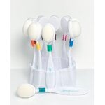
The last picture shows how I used the leftover ink on the ink blending brushes and the stencil which was turned 90 degrees after ink blending over the top of the cardstock as done on the first background. It made a great background for another card and there was no additional mess to clean afterwards!


Both card fronts were cut and layered using the two large dies from Gina K's Master Layouts 1 set. On the second card, the black piece is the smaller cut shape and layered under the stenciled piece to let the 'hello' be the focus. I used two nesting circle dies to make the black frame around the circle. The finishing touch is the little silver half pearls glued to the black cardstock under the 'hello' sentiment die cut.

THIS POST MAY CONTAIN AFFILIATE LINKS. BY CLICKING ON THEM AND PURCHASING PRODUCTS THROUGH MY LINKS, I RECEIVE A SMALL COMMISSION FOR THE REFERRAL. THE ITEM WILL NOT COST YOU ANY MORE BY GOING THROUGH THIS LINK.