Paper and Fiber Arts


Welcome to my mixed media blog. Thanks for stopping by.
Showing posts with label Catherine Pooler. Show all posts

Thursday, July 13, 2023

Stenciling Two Ways For Beautiful Card Backgrounds


Both of the cards shown today are made using the same stencil and ink colors. By stenciling them two different ways, you can create interesting and beautiful card backgrounds. The first card is ink blended by holding the stencil in place and overlapping the ink. Because the colors are on the cool side of the color wheel, it almost makes an ombre effect. For true ombre you would just blend a little more to have more subtle gradation. 

After stenciling the 4.25" x 5.5" cardstock piece, I Zentangled the closed circles with a variety of shapes. This is a really fun technique. If you'd like to see another card made this way, visit here.

Even though it looks really cool as it is, I decided to use the negative cuts from the next card to create a circle around the black 'hello'. 

The sentiment is an inset circle shape that I cut out of the surrounding circle with scissors. This is then inset into the negative cutaway pieces of the other stenciled card which is shown below.

The last picture shows how I used the leftover ink on the ink blending brushes and the stencil which was turned 90 degrees after ink blending over the top of the cardstock as done on the first background. It made a great background for another card and there was no additional mess to clean afterwards!


Both card fronts were cut and layered using the two large dies from Gina K's Master Layouts 1 set. On the second card, the black piece is the smaller cut shape and layered under the stenciled piece to let the 'hello' be the focus. I used two nesting circle dies to make the black frame around the circle. The finishing touch is the little silver half pearls glued to the black cardstock under the 'hello' sentiment die cut.

THIS POST MAY CONTAIN AFFILIATE LINKS. BY CLICKING ON THEM AND PURCHASING PRODUCTS THROUGH MY LINKS, I RECEIVE A SMALL COMMISSION FOR THE REFERRAL. THE ITEM WILL NOT COST YOU ANY MORE BY GOING THROUGH THIS LINK.


Monday, July 10, 2023

Stained Glass Medallion Cards

This card came about because I wanted to make the medallion from the Stained Glass Medallion die set look as close to stained glass as possible. Using a high gloss glue over the ink-blended cardstock gives a shiny, almost glass-like look.
 
Ink blending within the parameters of the shapes keeps the focus on the pretty die-cut design. Two layers of die-cuts are adhered together to form a well for the shiny glue to be poured into. 
The final touch was to add some of the shrink plastic die cuts as embellishments. The photo, below, is an auditioned cardstock background color. It is as good a choice as the green pictured above. Color is a personal choice, there is no right or wrong.

The second card is the same process without a die-cut sentiment or additional embellishments. Using black cardstock for the die-cuts to be framed upon makes for a bold card front. It looks almost like wall art.


Both the Glossy Accents from Ranger and Spellbinders Glaze 'N Glue work equally well in creating the shiny stained glass look. They also work well for adhering the die-cut pieces in place once the surface is dry.


THIS POST MAY CONTAIN AFFILIATE LINKS. BY CLICKING ON THEM AND PURCHASING PRODUCTS THROUGH MY LINKS, I RECEIVE A SMALL COMMISSION FOR THE REFERRAL. THE ITEM WILL NOT COST YOU ANY MORE BY GOING THROUGH THIS LINK.


Products Used:


Friday, June 30, 2023

Bubble Wrap Embossing


Accidental Embossing

An interesting thing happened when I laid a piece of mini-bubble wrap onto the card front when running it through the die-cutting machine to cut a smaller panel. I was trying to maintain the shape of the white splatters and hoped the bubble wrap would absorb enough of the pressure to keep the splatters intact. That did not happen but it created a fun, new look - Bubble Wrap Embossing! The picture below shows it in better detail.

Embossed with Bubble Wrap
The images on this card are stamped on a panel that was eventually cut to size using the Gina K. Master Layouts die set. The kraft cardstock layer was also cut using the set. After stamping the large floral image from the Altenew Tranquility Rose set and masking it to stamp the leaves, I decided to add the wonderful bee from the Sweet as Honey stamp set from Hero Arts. Then using Copic markers, I colored all of the images. This looked nice but a little flat. I put the mask back on the rose and ink blended with leftover ink on my blue blender brush. It still wasn't quite right. At this point, my go-to is either white or black splatters. The black ink was absorbed too much, so I used Dr. Ph Martin's bleedproof white to add a bit more interest. This looked great! Then I realized that I needed to cut the piece down a wee bit. 


It would have been possible to do it with a paper trimmer but I like the edge that you get with a die. And then the bubble wrap experiment happened. I really like the bubble wrap effect. What wasn't appealing was the smooshed splatters. When things go awry, my next go-to is adding bling. The sparkly stars and sequin pieces saved the mess and added a sort of magical element to the card.

If you give embossing with bubble wrap a try, I'd love to see it! Happy card-making!


THIS POST MAY CONTAIN AFFILIATE LINKS. BY CLICKING ON THEM AND PURCHASING PRODUCTS THROUGH MY LINKS, I RECEIVE A SMALL COMMISSION FOR THE REFERRAL. THE ITEM WILL NOT COST YOU ANY MORE BY GOING THROUGH THIS LINK.

Thursday, June 29, 2023

Venetian Neighborhood Using Three Different Coloring Techniques


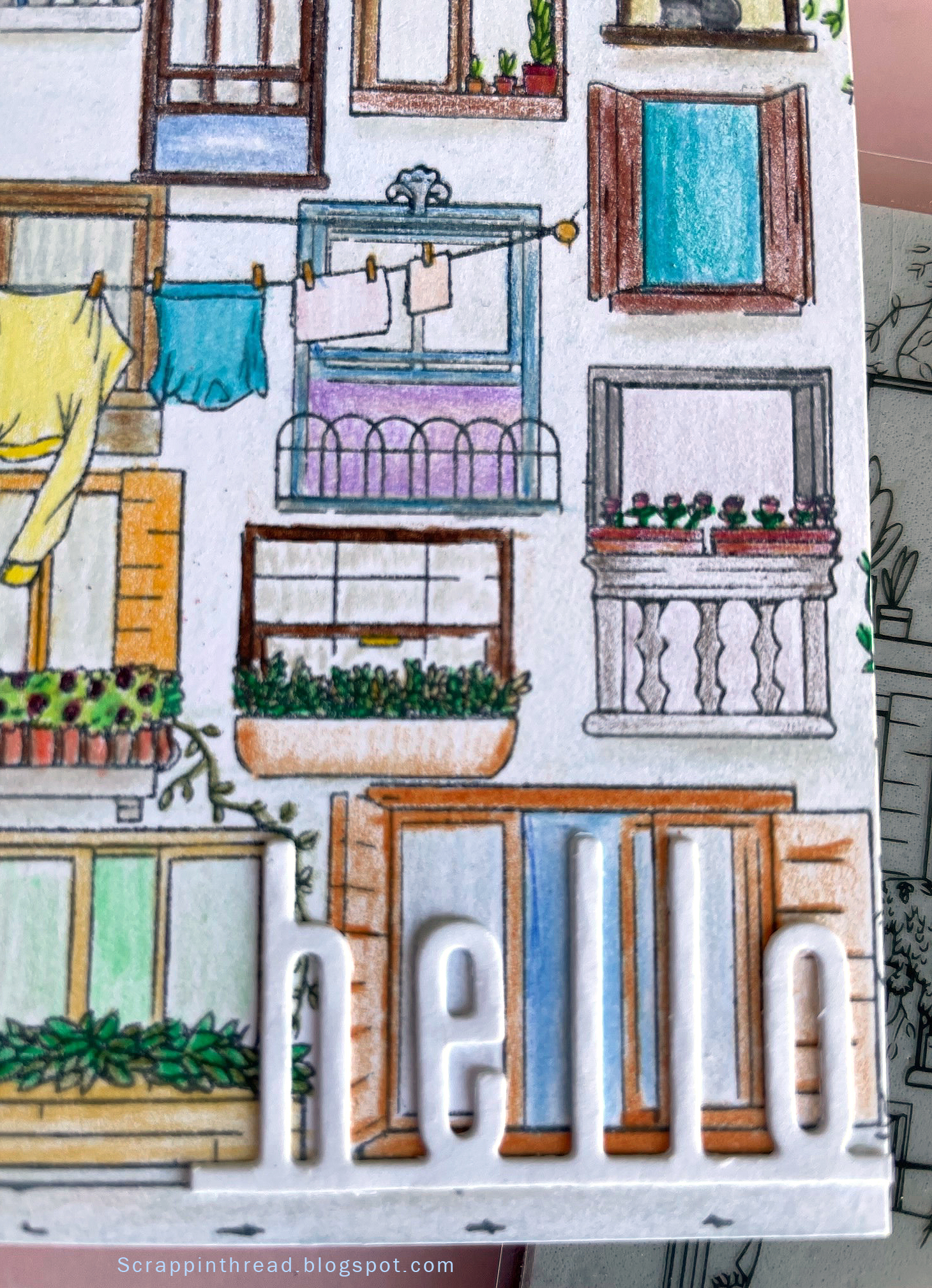
This Hero Arts stamp is an amazingly detailed large stamp that is perfect for many types of coloring techniques. I could have chosen more but stuck with three very different ones to showcase very different looks. And one of them is kind of a failure.


The stamped image is a Venetian neighborhood. I wanted something with an old-world, vintage vibe because Venice has an old-world charm.  And because Venice is known for its canals, the first choice was a water tie-in - watercolor.  This was done on dry paper. If it had been wet on wet, it would look different. Experimenting and playing are part of the process.


Using Prismacolor colored pencils to color this card front took a bit of time. Or it could be that I was coloring while watching tv and I am not as good at multi-tasking as I thought! Coloring can be as time-consuming as you'd like. Many times, I use Gamsol when using colored pencils to blend the color.  This time, I did not use anything to blend. It gives a more cartoony look to the card. That is ok because I wanted to use a very modern-looking Catherine Pooler 'hello" die cut.

Hero Arts Venetian Neighborhood Stamped Image

It is funny how the backdrop to the card can make the card appear to be a different shade. I'm showing both to let you see that photography can trick us into thinking something is not necessarily as it appears in real life. The background of the card is actually a very pale blush-tan color, not pink as it appears above.


The last card was an experiment. I debated showing it because it isn't what I normally want to show on here. But, it is important for me to remember that even 'failures' have merit. The lesson in this card is that tiny lines are difficult to color with pastels if you expect to stay inside the lines. The end result is very messy and sketchy. If that is the look you are after, great! Pastels are messy. They just are. Ultimately, I decided to embrace the mess and accept that this card gives an old-fashioned, found-this-in-an-attic-trunk kind of vibe. To fix the pastels, I used clear gesso. This made the cardstock curl. The front is glued to a side-folding 4.25" x 5.5" card base. The card base helps to tame the curl but, as you can see in the photo below, it still isn't flat.


Whatever materials you use to color your creations, enjoy the process and have fun!


THIS POST MAY CONTAIN AFFILIATE LINKS. BY CLICKING ON THEM AND PURCHASING PRODUCTS THROUGH MY LINKS, I RECEIVE A SMALL COMMISSION FOR THE REFERRAL. THE ITEM WILL NOT COST YOU ANY MORE BY GOING THROUGH THIS LINK.
Tuesday, June 27, 2023

Mixed Media Howdy Card


Many of us purchase mixed media supplies for art journaling but don't use them for much else. It is fun to use them on cards and scrapbook pages, too! This mixed media "Howdy" card is simple to make. And it packs a lot of texture without needing extra postage!


First, I applied Pink Candy Coat onto card stock with a palette knife over the Stacked Circles stencil from Hero Arts. The Candy Coat is a gloppy glaze with glitter and chunks of translucent pieces of something that looks like mylar mixed into the glaze. The picture above shows some of the sparkly bits that dry in place. There is no flaking, even when rubbed. After the piece dried, I blended ink onto the background and onto some of the discarded circle pieces from the Don't Be Square cover die using the Minted ink color from Catherine Pooler. Using a lot of ink in some areas and a light touch in others adds more dimension.  Using some white circles from the cover die as well as the inked ones give a random polka dot effect.

To keep the circle and discards from other projects' themes going, I used two large open circles. These were made because I did not separate the Round of Cheers dies from each other. What would normally have been trash was perfect for this card. Yay! After adhering all of the circles down, I trimmed the card front and placed it on a side folding 4.25" x 5.5" white card base. This makes a nice frame without adding extra bulk. The last step in adding a bit more dimension was to cut teeny tiny pieces of foam tape for the 'howdy' die cut to be popped up. The edges of the die cut that extended beyond the card front were then trimmed to size.

This card is difficult to photograph well. It looks better in person. :) But, maybe it will encourage you to try some of your mixed media supplies on a card?

THIS POST MAY CONTAIN AFFILIATE LINKS. BY CLICKING ON THEM AND PURCHASING PRODUCTS THROUGH MY LINKS, I RECEIVE A SMALL COMMISSION FOR THE REFERRAL. THE ITEM WILL NOT COST YOU ANY MORE BY GOING THROUGH THIS LINK.


roducts Used:
Products Used:
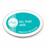
Catherine Pooler Designs - Party Collection - Premium Dye Ink Pads - Minted
Scrapbook.com