Paper and Fiber Arts


Welcome to my mixed media blog. Thanks for stopping by.
Showing posts with label Watercolor. Show all posts

Thursday, July 27, 2023

Watercolor Takes Practice


Recently, I completed two Altenew Academy classes on watercolor for card makers. After viewing the two different instructors' creations, the main takeaway is that watercolor takes practice. In my case, a lot of practice! The workshops are titled Botanical Illustration Inspired Watercolor, taught by Jaycee Gaspar, and Artists' Watercolor 101 for Paper Crafters with Emily Midgett. Each instructor has their own style, but both agreed that swatching your paints beforehand is a good idea.


It is time-consuming to swatch things. But the effort is worth it. The picture, above, shows the Altenew Essentials Pan set along with the painted piece of watercolor paper with each of the colors painted on it. There are swatches of each color mixed with the other colors, as well. I swatch all of my paints, inks, markers, embossing powders, and punches. It helps to have all of these things as a reference. Some of them I refer to more than others - but all of them provide me with an opportunity to see how the product works with the papers I use.

The card featured today shows the large rose and some of the foliage from the Tranquility Rose Stamp set stamped (and masked) onto watercolor paper with a light gray color. The use of the Silver Lake ink creates a no-line coloring image. This means that when the rose is painted, the lines fade into the image and are not very noticeable. For a true no-line watercolor, it is best to use the same color ink, when stamping, as will be used in painting. I didn't decide to go with yellow until after stamping so the stamped ink is faintly visible. After the watercolor dried, the panel was cut with a GinaK Designs frame and mounted onto a gray card front measuring 4.25" x 5.5". The sentiments come from the same Tranquility Rose stamp set. These are stamped with Obsidian Pigment ink. The butterflies are stamped with the same ink and heat embossed with clear powder. After coloring the images with Copic markers, they are popped up with foam. A few sequins complete the front panel. 

THIS POST MAY CONTAIN AFFILIATE LINKS. BY CLICKING ON THEM AND PURCHASING PRODUCTS THROUGH MY LINKS, I RECEIVE A SMALL COMMISSION FOR THE REFERRAL. THE ITEM WILL NOT COST YOU ANY MORE BY GOING THROUGH THIS LINK.


Altenew - Clear Photopolymer Stamps - Tranquility Rose
Scrapbook.com

Gina K Designs - Dies - Master Layouts 01
Scrapbook.com

Master Layouts Dies - Gina K. Website

Monday, July 24, 2023

Floral Stamp Three Ways

Large image stamps are wonderful for cards, art journals, and scrapbook layouts. The floral stamp from the Sweet as Honey Hero Arts set measures about 6.5" from the base of the stem to the top leaf. Stamping the image and heat embossing it on different types of paper allowed for exploring three different ways to use it on hand-created cards.
The first image, on the left, uses white embossing powder over white pigment ink on 100 lb cardstock. After the paper cooled, I ink-blended the embossed image with Catherine Pooler inks in cool colors. Wipe off the ink from the white embossed areas to make the colors shine. The middle image is stamped with Versamark without wiping off the leftover white ink and embossed with clear powder onto a heavy green cardstock.
The pink image is also heat embossed with white ink and white powder. This time it is on watercolor paper. It is easy to watercolor with embossed images because the embossing helps hold the watercolor inside the design. Sometimes, I audition stamped images onto backgrounds before deciding how to use them.
The picture above shows one of the images cut into two pieces and placed on an ink-blended background. And the picture below shows the intact image placed on a stenciled/ink-blended background. This was too busy for my liking.
Ultimately, I layered the image on a small solid panel placed over a heat-embossed background which has another piece of dark cardstock placed underneath and to one side of the front panel. The same dark green cardstock was used for the sentiment. The butterflies, sentiment, and background all use gold heat embossing powder. This is a 6-inch square card.
The 4.25" x 5.5" card, pictured below, also uses a gold embossed butterfly and sentiment. The sentiment is stamped onto the ink-blended panel. This is the same panel that was auditioned (and rejected,) above.
The panel adheres to a top-folding card base and the corners are rounded with a punch. Rounded corners soften the card. This design element is particularly welcome on a sympathy card.


The last card is also a 6-inch square card and is layered very similarly to the other square card. The butterflies are from the New Days Butterflies stamp set and colored with Copic markers. They add a bit of beauty to all of the cards.

Thank you for visiting!

THIS POST MAY CONTAIN AFFILIATE LINKS. BY CLICKING ON THEM AND PURCHASING PRODUCTS THROUGH MY LINKS, I RECEIVE A SMALL COMMISSION FOR THE REFERRAL. THE ITEM WILL NOT COST YOU ANY MORE BY GOING THROUGH THIS LINK.


Products Used:

Thursday, June 29, 2023

Venetian Neighborhood Using Three Different Coloring Techniques


This Hero Arts stamp is an amazingly detailed large stamp that is perfect for many types of coloring techniques. I could have chosen more but stuck with three very different ones to showcase very different looks. And one of them is kind of a failure.


The stamped image is a Venetian neighborhood. I wanted something with an old-world, vintage vibe because Venice has an old-world charm.  And because Venice is known for its canals, the first choice was a water tie-in - watercolor.  This was done on dry paper. If it had been wet on wet, it would look different. Experimenting and playing are part of the process.


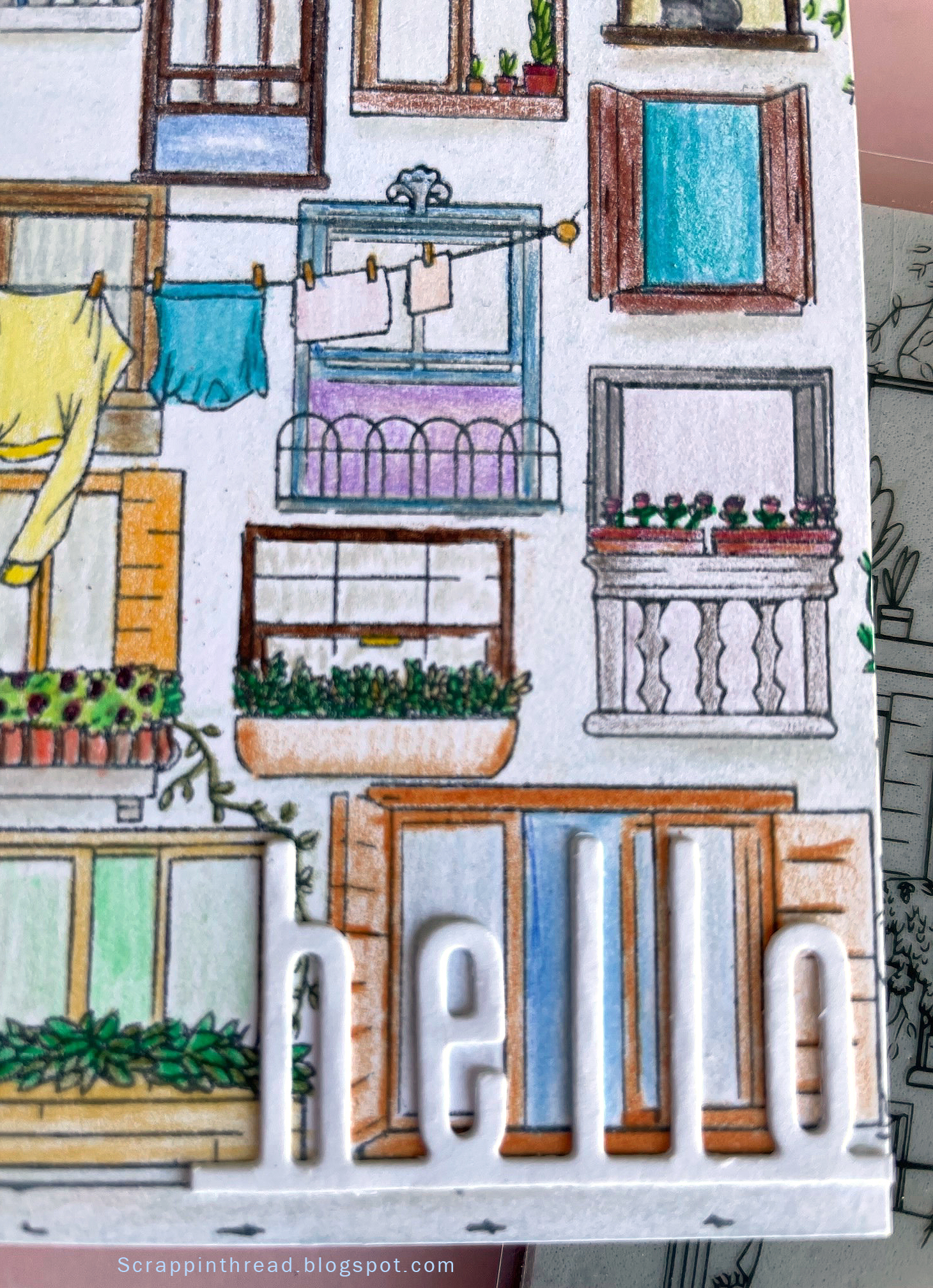
Using Prismacolor colored pencils to color this card front took a bit of time. Or it could be that I was coloring while watching tv and I am not as good at multi-tasking as I thought! Coloring can be as time-consuming as you'd like. Many times, I use Gamsol when using colored pencils to blend the color.  This time, I did not use anything to blend. It gives a more cartoony look to the card. That is ok because I wanted to use a very modern-looking Catherine Pooler 'hello" die cut.

Hero Arts Venetian Neighborhood Stamped Image

It is funny how the backdrop to the card can make the card appear to be a different shade. I'm showing both to let you see that photography can trick us into thinking something is not necessarily as it appears in real life. The background of the card is actually a very pale blush-tan color, not pink as it appears above.


The last card was an experiment. I debated showing it because it isn't what I normally want to show on here. But, it is important for me to remember that even 'failures' have merit. The lesson in this card is that tiny lines are difficult to color with pastels if you expect to stay inside the lines. The end result is very messy and sketchy. If that is the look you are after, great! Pastels are messy. They just are. Ultimately, I decided to embrace the mess and accept that this card gives an old-fashioned, found-this-in-an-attic-trunk kind of vibe. To fix the pastels, I used clear gesso. This made the cardstock curl. The front is glued to a side-folding 4.25" x 5.5" card base. The card base helps to tame the curl but, as you can see in the photo below, it still isn't flat.


Whatever materials you use to color your creations, enjoy the process and have fun!


THIS POST MAY CONTAIN AFFILIATE LINKS. BY CLICKING ON THEM AND PURCHASING PRODUCTS THROUGH MY LINKS, I RECEIVE A SMALL COMMISSION FOR THE REFERRAL. THE ITEM WILL NOT COST YOU ANY MORE BY GOING THROUGH THIS LINK.

Friday, May 5, 2023

10+ Cards Made with the Same Stamp/Die Set


Hello! This is a recap, with many pictures of the cards I created for Level 2 of the Altenew Educator Certification Program. My personal challenge was to use one stamp set for all ten courses. Here they are, and my shiny new badge which shows that I passed Level 1.


Original Post here


Original Post Here


Original Post Here

Original Post Here


Original Post Here


Original Post Here


Original Post Here


Original Post Here


Original Post Here


Original Post Here


Original Post Here

It always feels great to be able to use items several times over. It is very satisfying to stretch stamps and dies with different techniques. This makes the part of me that wants to be a mindful spender very happy.

Wednesday, May 3, 2023

Polychromatic Watercolor Layers on Cards


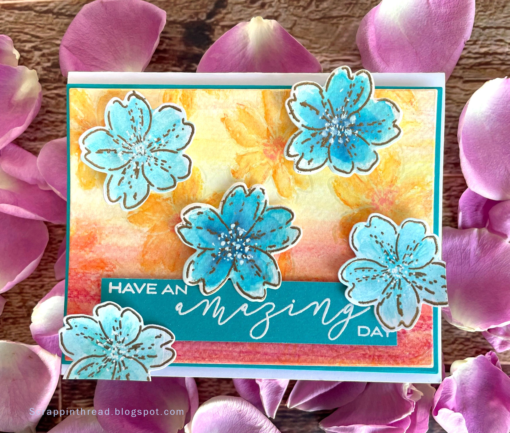
There have been many blog posts here about watercolors and cardmaking. However, they usually discuss specific media and techniques to achieve pleasing results. Today's post is a little different because the focus is on polychromatic watercolor layers on cards. Polychromatic means multiple colors. The inspiration for this card and a variation of this technique is from the Altenew Academy course: Polychromatic. 

Steps for background:

Scribble watercolor pencils on watercolor paper
Spritz with water
Move paint and water with a paintbrush
Let Dry
Scribble a little more watercolor pencil onto paper
Spritz with water
Move paint and water with a paintbrush
Let Dry
Randomly stamp floral outline image from Altenew's Build-a-Flower: Primrose set with Versamark
Heat emboss with a thick, clear embossing powder such as Amazing Glaze
Roughly color the stamped/embossed images with watercolor pencils
Wet the images with a thin watercolor brush or refillable watercolor brush
Let Dry
Touch up the images with additional color if needed
Cut panel with the smaller rectangle of the Master Layouts die cutting set from Gina K. Designs
Glue to a piece of teal blue cardstock that was cut with the larger rectangle die from the same Master Layouts set
Glue fun foam to the back of the layered panel and adhere to a top-folding A4 card base


Steps for Sentiment Strip:

Cut a piece of cardstock at least 4" x 13/16"  or cut it to that size after stamping and embossing
Treat with anti-static powder
Stamp sentiment - this is three separate stamps from the same Primrose set
Heat emboss with white embossing powder
Adhere foam tape to the back and pop it up onto the background piece which has already been attached to the card base

Steps for Blue Floral Images:

Stamp floral outline image from Altenew's Build-a-Flower: Primrose set with Versamark onto watercolor paper
Heat emboss with gold embossing powder
Roughly color the stamped/embossed images with watercolor pencils
Wet the images with a thin watercolor brush or refillable watercolor brush
Let Dry
Touch up the images with additional color if needed
Let Dry
Die cut images
Pop-up flowers with foam tape, one or two layers depending on the desired depth
Dot the centers of the flowers with a white gel pen or white paint

I like that there is a lot of depth and texture to the water coloring on this card. It also works well because of the high contrast in colors on the card. Please let me know if you enjoy using watercolors, too. Have a wonderful day!

THIS POST MAY CONTAIN AFFILIATE LINKS. BY CLICKING ON THEM AND PURCHASING PRODUCTS THROUGH MY LINKS, I RECEIVE A SMALL COMMISSION FOR THE REFERRAL. THE ITEM WILL NOT COST YOU ANY MORE BY GOING THROUGH THIS LINK.

Thursday, April 27, 2023

Creative Watercolor Media Card Made with Re-inkers


Creating a Watercolor Card with Re-inkers

The latest AECP class that I completed is the Creative Watercolor Media course in Level 2. There are many different ways to achieve a watercolor effect. Watercolors come in many forms: liquid, pan, pencil, crayon, dots, tubes, and sticks. However, this class is all about using ink with water to create a watercolor look without actually using watercolors. Just as pigment intensity varies with true watercolors, the pigment load exhibited in inks varies, too. The card pictured here is made with water-based dye inks from re-inker bottles. The more diluted the ink, the more transparent the painted image. But first, let us talk about the necessary supplies to work with re-inkers in this manner.

Paper Matters

There are many watercolor papers available. The kind that I used for this card is from Fabriano. It is 300 gsm, 140 lb, and comes in a 9 x 12 pad of 60 sheets. I mainly use it because it is more economical than many of the other papers I've used in the past. It does have the typical watercolor slightly-bumpy paper texture. This makes it challenging to achieve a crisp stamped image. Because these images were to be heat embossed with gold embossing powder, I wasn't very concerned about the texture of the paper. Using a stamping platform and double stamping with Versamark helps to ensure a good enough base for the powder to stick. I also made a background with re-inkers on the same paper as the stamped and die-cut images.

Creating a Background

The background was made by dropping dots of Burnt Red, Marigold, and Citrus Burst dye ink re-inkers onto wet watercolor paper, and then using a straw to blow air across the page. I also used a pipette to see if the same effect would be achieved. The pipette didn't work well because there was not enough air to move the water and ink. It came in handy to add more water, though. As it turned out, it is good that the background was never going to be the primary focus because the results were different from what I had hoped. The ink dots were too saturated and created blobs. Next time, I will mix the re-inker dots with water before applying the ink to the paper. 

After the background dried, I splattered some opaque white watercolor (Dr. Ph Martin's) and some gold metallic watercolor (Altenew's) over the paper. 

Painting the Stamped Images

Because of all of the little wells, using a mixed media mat made it easier to mix the ink with water. This also allowed for lots of surface area to dilute the ink even further. The picture above shows the four blue inks: Sea Breeze, Turquoise, Tide Blue, and Starlight, along with the green Firefly ink prior to mixing with water. I used a wet-on-wet technique which moves the ink and water on the images really easily. This is something that takes practice. Some of the flowers and leaves look better than others! The painterly effect of ink with water is always fun to behold. I like the contrast of the warm-colored background with the cool-colored flowers and leaves. To give depth to the card the blossoms are popped up with foam tape. The sentiment strip was laying on my desk leftover from another project. It fit perfectly.

THIS POST MAY CONTAIN AFFILIATE LINKS. BY CLICKING ON THEM AND PURCHASING PRODUCTS THROUGH MY LINKS, I RECEIVE A SMALL COMMISSION FOR THE REFERRAL. THE ITEM WILL NOT COST YOU ANY MORE BY GOING THROUGH THIS LINK.

Thursday, March 16, 2023

AECP Easy Die Cutting Techniques


Hello! Today's post is inspired by the Altenew Academy's Easy Die Cutting Techniques course taught by Yana Smakula. The last two blog posts also included die-cutting elements but this one will show an additional way to use die cuts. 


Inlaid die cut and popped up die cut in white

Inlaid Die Cuts

This is a fun way to expand your die cuts, especially background or cover plate dies. You can vary the inlay depth by choosing to pop up the negative cuts or inlay them like tilework. 


The first card is watercolor paper painted with reinkers. I have a lot of reinkers! And this is another way to use products from my stash. The colors used are mainly discontinued Close To My Heart colors and a couple of PinkFresh Studio ones, as well. The white cube pieces are glued on top of the watercolored pieces and reinserted into the cover die-cut piece. I wanted the 'love' to show up well, so underneath the word are the original pieces placed back into the die.
Radial Hearts Cover Die Inlaid Technique

The base layer of this card is die-cut with all of the pieces replaced. After adhering them into place, I ink-blended the base.  Cutting the teal paper with the die allowed a lot of flexibility in how many pieces to use to adhere on top of the base. It also allowed for three of the hearts to be glued onto the top of the circle around the sentiment. The card base could have been made by embossing the die cut instead of cutting out the base layer. I rarely pre-plan my cards and layouts so that did not occur to me until the card was almost completed.


Inlaid die-cutting
The "love" circle is part of a set from Taylored Expressions. The circle part is cut from the word on the liquid watercolor/reinker card.


THIS POST MAY CONTAIN AFFILIATE LINKS. BY CLICKING ON THEM AND PURCHASING PRODUCTS THROUGH MY LINKS, I RECEIVE A SMALL COMMISSION FOR THE REFERRAL. THE ITEM WILL NOT COST YOU ANY MORE BY GOING THROUGH THIS LINK.


Products Used: