The 'hello' sentiment is from my scrap pile and I can't locate the die to let you know from where it came! It is great to use up scraps from other projects or from die-cutting marathons, but not very helpful when trying to remember the origin!
Paper and Fiber Arts
Welcome to my mixed media blog. Thanks for stopping by.
Tuesday, July 11, 2023
Vellum and Kraft Card
This is a 5" x 7" top folding card made mainly with kraft card stock. The vellum overlay layer softens the sharp lines of the medallion die cut. And it also tempers the busyness of all of the stars. I got a bit carried away when gluing the little stars. These would have normally been trash because they are the off-cuts from the larger die cuts - but they are perfectly usable.
The 'hello' sentiment is from my scrap pile and I can't locate the die to let you know from where it came! It is great to use up scraps from other projects or from die-cutting marathons, but not very helpful when trying to remember the origin!
Monday, July 10, 2023
Stained Glass Medallion Cards
This card came about because I wanted to make the medallion from the Stained Glass Medallion die set look as close to stained glass as possible. Using a high gloss glue over the ink-blended cardstock gives a shiny, almost glass-like look.
Ink blending within the parameters of the shapes keeps the focus on the pretty die-cut design. Two layers of die-cuts are adhered together to form a well for the shiny glue to be poured into.
The final touch was to add some of the shrink plastic die cuts as embellishments. The photo, below, is an auditioned cardstock background color. It is as good a choice as the green pictured above. Color is a personal choice, there is no right or wrong.
The second card is the same process without a die-cut sentiment or additional embellishments. Using black cardstock for the die-cuts to be framed upon makes for a bold card front. It looks almost like wall art.
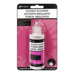
Both the Glossy Accents from Ranger and Spellbinders Glaze 'N Glue work equally well in creating the shiny stained glass look. They also work well for adhering the die-cut pieces in place once the surface is dry.
THIS POST MAY CONTAIN AFFILIATE LINKS. BY CLICKING ON THEM AND PURCHASING PRODUCTS THROUGH MY LINKS, I RECEIVE A SMALL COMMISSION FOR THE REFERRAL. THE ITEM WILL NOT COST YOU ANY MORE BY GOING THROUGH THIS LINK.
Products Used:
Labels:
Altenew,
cards,
Catherine Pooler,
clean and simple,
Die cuts,
glossy accents,
Sizzix,
Spellbinders
Sunday, July 9, 2023
Red and White Hugs Card
This card is easy and very quick to make because it is just layering/stacking die-cuts. Using two high-contrast colors makes a bold statement in a clean and simple way. Red and white are always a good combination. Do you have two favorite colors to try this technique?
THIS POST MAY CONTAIN AFFILIATE LINKS. BY CLICKING ON THEM AND PURCHASING PRODUCTS THROUGH MY LINKS, I RECEIVE A SMALL COMMISSION FOR THE REFERRAL. THE ITEM WILL NOT COST YOU ANY MORE BY GOING THROUGH THIS LINK.
Labels:
Altenew,
cards,
clean and simple,
Die cuts
Friday, July 7, 2023
Zentangling on Cards
Amber Davis teaches a class for Altenew Academy titled, Zentangle for Cardmakers. It has many ideas about incorporating doodles or Zentangle designs onto card fronts. If you enjoy doodling or Zentangling, add this fun, personal touch to your next project. Here are the steps for Zentangling on the card pictured above.
First, choose an open stencil design and ink blend onto a 4.25" x 5.5" card front. These two colors mixed together in the middle of the card front netted an additional orangey-coral color. Next, add Zentangles or your own doodle designs onto as many white areas as you like. I used the 005 and 01 pens from the Fine Liner Pen Set for the designs. The picture, below, shows the designs prior to shading with graphite pencils.
After adding shading with pencils and a blending stump on the Zentangled areas, I ink-blended the hugs die-cut and the circle that surrounded it. These are the same ink colors as the stenciled card front and are then cut apart. The hugs die is designed as an inset into a card front. By using the Hero Arts circle die, it can be cut out with a frame. Auditioning the circle with the word attached, led me to decide to separate the word and cut the circle into pieces. The circle segments are glued to the front and the sentiment is popped up with foam tape.
I love the bold look of the stencil with the Zentangling, the bright colors, and the way the card came together. If you make any doodled or Zentangled projects, I'd love to hear about them.
THIS POST MAY CONTAIN AFFILIATE LINKS. BY CLICKING ON THEM AND PURCHASING PRODUCTS THROUGH MY LINKS, I RECEIVE A SMALL COMMISSION FOR THE REFERRAL. THE ITEM WILL NOT COST YOU ANY MORE BY GOING THROUGH THIS LINK.
Products Used:
Circled Greetings: Hugs Die - Altenew Website
Nesting Circle Dies (used to cut out the Circled Greetings dies) - Hero Arts Website
Tuesday, July 4, 2023
Stenciling With Markers
Here are two cards made with the same stencil and dies. The stenciling was done with two different types of markers.
First, the card with the negative piece of the 'hugs' die cut was colored with Karin pigment brush markers. These are non-pumping, meaning you shake them and they are ready for painting onto the cardstock.The Decobrush markers contain opaque acrylic, non-toxic organic pigment-based paint. I wanted to use them as line art, rather than fill in the shapes. This worked great for all except the purple, which leaked under the stencil. That is an operator error issue and had I dabbed off the paint onto scrap paper, it wouldn't have occurred.
![]() |
| Hero Arts Stacked Circle Stencil With Karin Paint Pen Marker |
The second card is made with the same stencil. This time the shapes are colored in with Zig Clean Color Real Brush markers. These are waterbased and provide a concentrated pop of color.
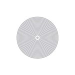
Initially, I was going to assemble the card as pictured above. To cut the Altenew 'hugs' out as a circular piece, one needs to use a circle die that is large enough to go around the perimeter of the word. You can make the circular frame as large as your largest circle. However, I like to make it about as narrow as the lettering. Having a set of nesting dies helps so you can audition the sizes before actually cutting. In the end, the black piece was cut using the nesting circle and the 'hugs' die, and a white piece with just the sentiment, as pictured below. I like the color peeking out from under the clean and simple top piece.
THIS POST MAY CONTAIN AFFILIATE LINKS. BY CLICKING ON THEM AND PURCHASING PRODUCTS THROUGH MY LINKS, I RECEIVE A SMALL COMMISSION FOR THE REFERRAL. THE ITEM WILL NOT COST YOU ANY MORE BY GOING THROUGH THIS LINK.
Monday, July 3, 2023
The Background Determines the Aesthetic
When designing a card sometimes the background determines the aesthetic. Both of these cards use the same Hero Arts' Cobblestone Bold Prints stamp. The lighter-colored card was stamped with black ink onto white cardstock. The cobblestones were shaded with gray colored pencils. The card pictured below was stamped with Versamark onto watercolor paper without cleaning the stamp first. The residual black ink on the stamp mixed with the sticky watermark ink to create a light gray color. By using clear embossing powder, it maintained that color while sealing it in.To give the background an antique look, I blended brown ink with a blending tool. It gave the background a nice patina which then informed my decisions about layering brown cardstock underneath and using kraft paper for the sentiment tag.
I wanted to keep the background light with the pencil shading on the card pictured below. It seemed somewhat somber and old-fashioned, so it was turned into a sympathy card. It could also be used as an encouragement card for someone who prefers muted tones.
Both cards have layered cardstock using Gina K. Designs Master Layouts dies and the wonderful stamped bee image from the Hero Arts Sweet as Honey set. The 'sending hugs' die is a retired CTMH product.
The background also influenced the choice of Copic marker colors for the flowers. Here is a picture of the blossoms that I thought I would use. I didn't end up using the tall, thin floral spray or stem.
Both cards have layered cardstock using Gina K. Designs Master Layouts dies and the wonderful stamped bee image from the Hero Arts Sweet as Honey set. The 'sending hugs' die is a retired CTMH product.
THIS POST MAY CONTAIN AFFILIATE LINKS. BY CLICKING ON THEM AND PURCHASING PRODUCTS THROUGH MY LINKS, I RECEIVE A SMALL COMMISSION FOR THE REFERRAL. THE ITEM WILL NOT COST YOU ANY MORE BY GOING THROUGH THIS LINK.
Products Used:
Subscribe to:
Posts (Atom)