Paper and Fiber Arts


Welcome to my mixed media blog. Thanks for stopping by.
Showing posts with label Kraft. Show all posts

Friday, July 14, 2023

Kraft, Black, and White Medallion Card


Kraft, black, and white are a gorgeous combination. It is gender-neutral, striking, and fun to use for card-making. Actually, I also used it when scrapbooking and still use it in my journaling and mixed media projects. It is a good go-to combination. Adding a pop of color takes it up a notch - see the green die-cut sentiment on the card at the bottom of the post for an example.

The medallion is sold with a suggested illustration of layering the three die cuts. I did that but added additional layers and turned the die a bit for a more robust, stacked design. The card above has a stamped and heat-embossed sentiment from the Altenew Tranquility Rose set.

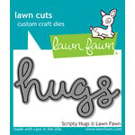
When determining the layout of a card I audition the components prior to adhering them. I think this configuration works well because there are three sections to the card front. The heaviness of the two medallion shapes is balanced by a large sentiment, even though the lettering is thin.  I love this modern font. Unfortunately, "sending hugs" is a retired CTMH die. Do you have a favorite die?


THIS POST MAY CONTAIN AFFILIATE LINKS. BY CLICKING ON THEM AND PURCHASING PRODUCTS THROUGH MY LINKS, I RECEIVE A SMALL COMMISSION FOR THE REFERRAL. THE ITEM WILL NOT COST YOU ANY MORE BY GOING THROUGH THIS LINK.

Scrapbook.com

Altenew - Clear Photopolymer Stamps - Tranquility Rose
Scrapbook.com

Master Layouts Dies - Gina K. Website


Tuesday, July 11, 2023

Vellum and Kraft Card

 This is a 5" x 7" top folding card made mainly with kraft card stock. The vellum overlay layer softens the sharp lines of the medallion die cut. And it also tempers the busyness of all of the stars. I got a bit carried away when gluing the little stars. These would have normally been trash because they are the off-cuts from the larger die cuts - but they are perfectly usable.


The 'hello' sentiment is from my scrap pile and I can't locate the die to let you know from where it came! It is great to use up scraps from other projects or from die-cutting marathons, but not very helpful when trying to remember the origin!


THIS POST MAY CONTAIN AFFILIATE LINKS. BY CLICKING ON THEM AND PURCHASING PRODUCTS THROUGH MY LINKS, I RECEIVE A SMALL COMMISSION FOR THE REFERRAL. THE ITEM WILL NOT COST YOU ANY MORE BY GOING THROUGH THIS LINK.

Saturday, June 3, 2023

Gender Neutral Cards - Several Techniques

Life has been busy! This past month I've been enjoying sunny weather, a bit of travel, and doing things out of doors. Because of that, I'm combining several cards and techniques into one post. Today's post has five different cards that do not really fit into a specific theme - other than they are part of the Altenew Educator Certification Program's Level 2 Challenge. The cards are supposed to be masculine, but gender-neutral is a better description. There are many photos because there are several techniques used on the cards.

This first card combines ink blending and masking. In order to get extra dimension, you can remove the mask and add an additional layer of ink. It is fun to mix different ink colors for intense backgrounds.

If your recipient is a clean and simple lover, stop here. The card looks nice this way, but adding the die-cut leaves as shown in the photo at the top of the post adds even more pizzaz. 

One of the easiest backgrounds to make for a card is to emboss or deboss a piece of cardstock. Or, as in the example above, a piece of mirrored cardstock. The depth and dimension achieved by such a simple technique are always impressive. This cardstock from, Spellbinders, embosses really well.

Altenew's Flowers and Leaves 3D Embossing Folder

Spellbinder's Mirror Cardstock is Two-sided

The frame and sentiment are from Spellbinder's Four Petal Collection. Layering the silver with black nets a classy look achieved with little effort. The same sentiment set is used on the "love you" kraft card, pictured below.


One of my favorite color combinations is kraft cardstock with white. The addition of vellum adds another layer without obscuring the stamping on the background. This card uses heat embossing for the stamped daisies, layering the die-cut sentiment, and using negative die-cut pieces from a cover die to create an interesting background. 

In order to have stamped/embossed images without little flakes of embossing powder all over, use an anti-static powder tool prior to stamping. This helps create a polished finished project. 


The flowers are from a retired set, Beloved Daisy. You can try this with many different stamps, though. When looking to heat emboss a stamped image, you want one that is defined enough to not need details added to the image afterward because it can be difficult to stamp onto the slick surface of the heated embossing powder. To increase the opacity of the white embossing powder, use white pigment ink instead of clear embossing ink. 

When my daughter saw this card, she said it reminded her of toasted marshmallows. I love that it conveys a warm, sweet, feeling. Plus, it was fun to get out the modeling paste and mix in some re-inker to create that very lightly colored marshmallow-looking texture. The bottom layer of the card is gold mirrored cardstock which adds an extra layer to tie in the warm colors of the inks and stenciled medium. 
Mega Love Die Cut Out of Marbled Background

After mixing a few drops of Pastel Sunrise re-inker into the Light Molding Paste Gel Medium, I used an old gift card to swipe it through the Grid Stencil. The stencil was turned 45 degrees so it would sit on the card on-point. Using light molding paste doesn't add much weight to the card yet it holds up very well, once dry. The corners of the background were ink blended with the Pastel Sunrise ink pad and whatever yellow ink was leftover on my ink blender sponge. The XOXO, from Sentiment Strips - Set 1, was stamped with Permanent Black Crisp Ink and also ink blended with the leftover yellow. For instructions on how to make the marbled glossy background, please visit here.

Mixed Media in Progress

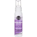
There are a couple of things to keep in mind when working with gel mediums. One is that the drying time will be influenced by environmental factors. I don't like to dry molding paste with a heat tool because it seems more prone to cracking. When I lived in Arizona, things dried far faster than where I live now - which is in Portland, Oregon. Except in the summertime, when it is quite dry. Additionally, if you are going to color the medium, and consistency of color is important, try to make enough of the paste at one time. It is difficult to replicate an exact match. This isn't usually a problem because 'close enough' is usually good enough, but it will depend on your project and the effect you are after. Also, the best adhesive for adhering items to the dried paste is one that offers good adhesion without breaking down the textured surface. I find that iCraft Mixed Media Adhesive works well.


This last card uses the same grid stencil and Mega Love die cut from another marbled background. But because ink blending was used to make the background, it gave a very different look. To achieve the rainbow effect, I used pink, yellow, and blue ink and overlapped them to create secondary orange and green colors. This is super easy to do. Mixing colors on paper is a fast and effective way to achieve more interest when ink blending.

If making cards for others is something that brings you joy, I hope that you consider trying one of these techniques on your next project. Cheers.


THIS POST MAY CONTAIN AFFILIATE LINKS. BY CLICKING ON THEM AND PURCHASING PRODUCTS THROUGH MY LINKS, I RECEIVE A SMALL COMMISSION FOR THE REFERRAL. THE ITEM WILL NOT COST YOU ANY MORE BY GOING THROUGH THIS LINK.

Sunday, April 16, 2023

Potted Plants Card Set - Challenge 1 Altenew Part One

Scroll for the Potted Plants :)

Masculine Card Set

Hello! The Altenew challenge consists of two card sets but because of the length of the posts, I am separating the AECP Level One Final Challenge into two parts. This part of the assignment is to complete a set of 'masculine' cards and packaging for the set. The colors used in the set are more traditionally used for masculine cards. However, this set of cards is suitable for gifting to anyone. Please be aware that there are many photos because, in addition to showing each of the eight cards, there are some process photos.  Here is the Potted Plants Card Set:

Eight Thematically Based Cards

Though there are similar characteristics, each card is different from the others. For specific tasks, it was easiest to work with a mass production goal. For example, to make clean-up easier I heat embossed all of the pieces at the same time. This included doing the leafy part, pictured below as a tag on the gift bag.


Ink Techniques

Working with inks and paper and watching them transform into something different always brings me joy! Using the AECP courses as a guide to choosing paper crafting techniques to showcase, I selected some fun and easy ones to implement. As already mentioned, heat embossing was used for many of the cards. Another Wow! technique is to apply ink directly to paper. Sliding the ink pad onto the paper in straight lines can create a woodgrain effect. The picture below shows Almond Butter ink applied to a light-colored kraft cardstock (on the left) and the original paper on the right-hand side.

Woodgrain Effect with Direct-to-Paper Inking

Ink Pad Types

The direct-to-paper technique pictured above uses dye ink. It is fast-drying and not as messy as stickier inks. Why use messier inks? Using pigment ink will oftentimes result in more intense colors. And some colors, such as metallics, are not available as dye inks. Watermark inks and pigment inks are usually the recommended ink types for heat embossing. The heat-embossed plant/tag was stamped with a combination of dye ink and Versamark, then embossed with clear powder. This was used as the base for an ink resist technique. Rather than get out another ink, I used leftover blue ink on the blending brush to fill in the background. 

Gold Pigment Ink Applied to Paper Edges

More Ink-to-Paper Techniques

Pigment ink is slower to dry. It does not need to be embossed, but a heat tool will speed up the process.  I used the gold ink pad to bring some extra depth to the edge of the paper by running the ink pad around each of the sides. Because the overall effect is grungy, it is very forgiving and you do not need to worry about a crisp application. It is ok to mix inks. The picture below shows the same pigment-edged paper after dye ink was applied with an ink blending tool. Notice that ink wasn't deliberately applied in the middle as that part will be covered with patterned paper.


Ink blending along the perimeter of the page

Continuing in an assembly-line manner, everything was stamped and embossed or colored and then die-cut as needed.  My process is to sort out backgrounds first and then assemble cards based on the elements being used. It helps me to have a big picture so I sometimes will lay out everything to see what components might be missing. The photo below shows this step.

Stamping and Coloring

All of the pots were colored with either woodless colored pencils or alcohol markers. I used either an alcohol blender marker or a paper stump dipped in alcohol to blend the media on the pots. It is easiest for me to color and then die-cut the images. Die cuts allow the various components to be raised above the background or card base. It adds another wonderful layer of dimension and depth to the card. Additional postage may be required for mailing, though.

Most of the cards have the potted plants raised off the base with foam tape. The plants are inserted into a small slit on many of the pots. This was achieved using a handheld craft knife.

Plants inserted into a slit cut into the pot

Plants are not always green. And in card making, any color can be used!


Using different sentiments, whether stamped or die cut, allows for many options in card sending.


The cards don't have to all have plants to still be a part of the set. Using enough of the other components ties this clean and simple card together with the rest of the set. The very first card at the top of the post is also a CAS card made for the set.

Clean and Simple Card


Recycling A Shopping Bag

Packaging a gift does not need to be fancy. When I was unpacking from a family trip last week, I found this polka-dot bag from a souvenir purchase. Even though the colors are different, it seemed like a great tie-in to the dots on the cards. Brown paper packaging with twine wrapping is one of my favorites for gift-giving. The use of a recycled bag complements the card set. After punching two small holes in it, the embossed tag worked well as a way to hold the twine in place.


THIS POST MAY CONTAIN AFFILIATE LINKS. BY CLICKING ON THEM AND PURCHASING PRODUCTS THROUGH MY LINKS, I RECEIVE A SMALL COMMISSION FOR THE REFERRAL. THE ITEM WILL NOT COST YOU ANY MORE BY GOING THROUGH THIS LINK.

Saturday, June 22, 2019

Stenciling Card Fronts


If you are anything like me, you want to maximize your supplies and tools by getting as much use out of them as you can. I love stencils because of their versatility. Mainly, I use them for art journaling. They are fun for scrapbooking, too. Some stencils are scaled specifically for use on cards. However, those that are smaller or larger can, of course, be used for card fronts, too! There are thousands of stencils commercially available.  You can also make your own!  Whatever your style and color palette, you can choose what speaks to you when stenciling card fronts.


Altenew Weave Builder Stencil with Distress Inks on the card front

These cards use the same stencil with two different colorways and styles.  It is fun to see what you can create by changing the colors. Do you have favorite products to use with stencils? Inking is probably the easiest way to apply color to paper.  For color and texture, Tonic Studios Nuvo Mousse is very easy to use - and to clean up.  Glitter paste is another fun and easy way to add both color and texture. Spraying ink, mica mist, flowable paint, and anything else that can go through a spray bottle are all great mediums to try.  Acrylic or watercolor paint can be applied directly to paper or applied over other media.  Watercolor paper is a great base for wet media. I use washi tape to hold down the stencil. Painters tape will work to hold the stencil in place, too. If you have a bit of time, it is a relaxing activity to doodle with markers in the open areas of the stencil.  For example, use the spaces to Zentangle.

Some of my favorite things
In case you are in the market for any new goodies in the Nuvo line, Tonic Studios is part of Scrapbook.com's 7 days of summer sale. 
Today's Freebie
Thank you for stopping by today! And in case you were wondering, these are some of the items I used on the two cards pictured above: