Paper and Fiber Arts


Welcome to my mixed media blog. Thanks for stopping by.
Showing posts with label Embossing. Show all posts

Thursday, July 27, 2023

Watercolor Takes Practice


Recently, I completed two Altenew Academy classes on watercolor for card makers. After viewing the two different instructors' creations, the main takeaway is that watercolor takes practice. In my case, a lot of practice! The workshops are titled Botanical Illustration Inspired Watercolor, taught by Jaycee Gaspar, and Artists' Watercolor 101 for Paper Crafters with Emily Midgett. Each instructor has their own style, but both agreed that swatching your paints beforehand is a good idea.


It is time-consuming to swatch things. But the effort is worth it. The picture, above, shows the Altenew Essentials Pan set along with the painted piece of watercolor paper with each of the colors painted on it. There are swatches of each color mixed with the other colors, as well. I swatch all of my paints, inks, markers, embossing powders, and punches. It helps to have all of these things as a reference. Some of them I refer to more than others - but all of them provide me with an opportunity to see how the product works with the papers I use.

The card featured today shows the large rose and some of the foliage from the Tranquility Rose Stamp set stamped (and masked) onto watercolor paper with a light gray color. The use of the Silver Lake ink creates a no-line coloring image. This means that when the rose is painted, the lines fade into the image and are not very noticeable. For a true no-line watercolor, it is best to use the same color ink, when stamping, as will be used in painting. I didn't decide to go with yellow until after stamping so the stamped ink is faintly visible. After the watercolor dried, the panel was cut with a GinaK Designs frame and mounted onto a gray card front measuring 4.25" x 5.5". The sentiments come from the same Tranquility Rose stamp set. These are stamped with Obsidian Pigment ink. The butterflies are stamped with the same ink and heat embossed with clear powder. After coloring the images with Copic markers, they are popped up with foam. A few sequins complete the front panel. 

THIS POST MAY CONTAIN AFFILIATE LINKS. BY CLICKING ON THEM AND PURCHASING PRODUCTS THROUGH MY LINKS, I RECEIVE A SMALL COMMISSION FOR THE REFERRAL. THE ITEM WILL NOT COST YOU ANY MORE BY GOING THROUGH THIS LINK.


Altenew - Clear Photopolymer Stamps - Tranquility Rose
Scrapbook.com

Gina K Designs - Dies - Master Layouts 01
Scrapbook.com

Master Layouts Dies - Gina K. Website

Monday, July 24, 2023

Floral Stamp Three Ways

Large image stamps are wonderful for cards, art journals, and scrapbook layouts. The floral stamp from the Sweet as Honey Hero Arts set measures about 6.5" from the base of the stem to the top leaf. Stamping the image and heat embossing it on different types of paper allowed for exploring three different ways to use it on hand-created cards.
The first image, on the left, uses white embossing powder over white pigment ink on 100 lb cardstock. After the paper cooled, I ink-blended the embossed image with Catherine Pooler inks in cool colors. Wipe off the ink from the white embossed areas to make the colors shine. The middle image is stamped with Versamark without wiping off the leftover white ink and embossed with clear powder onto a heavy green cardstock.
The pink image is also heat embossed with white ink and white powder. This time it is on watercolor paper. It is easy to watercolor with embossed images because the embossing helps hold the watercolor inside the design. Sometimes, I audition stamped images onto backgrounds before deciding how to use them.
The picture above shows one of the images cut into two pieces and placed on an ink-blended background. And the picture below shows the intact image placed on a stenciled/ink-blended background. This was too busy for my liking.
Ultimately, I layered the image on a small solid panel placed over a heat-embossed background which has another piece of dark cardstock placed underneath and to one side of the front panel. The same dark green cardstock was used for the sentiment. The butterflies, sentiment, and background all use gold heat embossing powder. This is a 6-inch square card.
The 4.25" x 5.5" card, pictured below, also uses a gold embossed butterfly and sentiment. The sentiment is stamped onto the ink-blended panel. This is the same panel that was auditioned (and rejected,) above.
The panel adheres to a top-folding card base and the corners are rounded with a punch. Rounded corners soften the card. This design element is particularly welcome on a sympathy card.


The last card is also a 6-inch square card and is layered very similarly to the other square card. The butterflies are from the New Days Butterflies stamp set and colored with Copic markers. They add a bit of beauty to all of the cards.

Thank you for visiting!

THIS POST MAY CONTAIN AFFILIATE LINKS. BY CLICKING ON THEM AND PURCHASING PRODUCTS THROUGH MY LINKS, I RECEIVE A SMALL COMMISSION FOR THE REFERRAL. THE ITEM WILL NOT COST YOU ANY MORE BY GOING THROUGH THIS LINK.


Products Used:

Monday, July 3, 2023

The Background Determines the Aesthetic

 When designing a card sometimes the background determines the aesthetic. Both of these cards use the same Hero Arts' Cobblestone Bold Prints stamp. The lighter-colored card was stamped with black ink onto white cardstock. The cobblestones were shaded with gray colored pencils. The card pictured below was stamped with Versamark onto watercolor paper without cleaning the stamp first. The residual black ink on the stamp mixed with the sticky watermark ink to create a light gray color. By using clear embossing powder, it maintained that color while sealing it in.

To give the background an antique look, I blended brown ink with a blending tool. It gave the background a nice patina which then informed my decisions about layering brown cardstock underneath and using kraft paper for the sentiment tag. 
The background also influenced the choice of Copic marker colors for the flowers. Here is a picture of the blossoms that I thought I would use. I didn't end up using the tall, thin floral spray or stem.
I wanted to keep the background light with the pencil shading on the card pictured below. It seemed somewhat somber and old-fashioned, so it was turned into a sympathy card. It could also be used as an encouragement card for someone who prefers muted tones.

Both cards have layered cardstock using Gina K. Designs Master Layouts dies and the wonderful stamped bee image from the Hero Arts Sweet as Honey set. The 'sending hugs' die is a retired CTMH product.

Friday, June 30, 2023

Bubble Wrap Embossing


Accidental Embossing

An interesting thing happened when I laid a piece of mini-bubble wrap onto the card front when running it through the die-cutting machine to cut a smaller panel. I was trying to maintain the shape of the white splatters and hoped the bubble wrap would absorb enough of the pressure to keep the splatters intact. That did not happen but it created a fun, new look - Bubble Wrap Embossing! The picture below shows it in better detail.

Embossed with Bubble Wrap
The images on this card are stamped on a panel that was eventually cut to size using the Gina K. Master Layouts die set. The kraft cardstock layer was also cut using the set. After stamping the large floral image from the Altenew Tranquility Rose set and masking it to stamp the leaves, I decided to add the wonderful bee from the Sweet as Honey stamp set from Hero Arts. Then using Copic markers, I colored all of the images. This looked nice but a little flat. I put the mask back on the rose and ink blended with leftover ink on my blue blender brush. It still wasn't quite right. At this point, my go-to is either white or black splatters. The black ink was absorbed too much, so I used Dr. Ph Martin's bleedproof white to add a bit more interest. This looked great! Then I realized that I needed to cut the piece down a wee bit. 


It would have been possible to do it with a paper trimmer but I like the edge that you get with a die. And then the bubble wrap experiment happened. I really like the bubble wrap effect. What wasn't appealing was the smooshed splatters. When things go awry, my next go-to is adding bling. The sparkly stars and sequin pieces saved the mess and added a sort of magical element to the card.

If you give embossing with bubble wrap a try, I'd love to see it! Happy card-making!


THIS POST MAY CONTAIN AFFILIATE LINKS. BY CLICKING ON THEM AND PURCHASING PRODUCTS THROUGH MY LINKS, I RECEIVE A SMALL COMMISSION FOR THE REFERRAL. THE ITEM WILL NOT COST YOU ANY MORE BY GOING THROUGH THIS LINK.

Saturday, June 3, 2023

Gender Neutral Cards - Several Techniques

Life has been busy! This past month I've been enjoying sunny weather, a bit of travel, and doing things out of doors. Because of that, I'm combining several cards and techniques into one post. Today's post has five different cards that do not really fit into a specific theme - other than they are part of the Altenew Educator Certification Program's Level 2 Challenge. The cards are supposed to be masculine, but gender-neutral is a better description. There are many photos because there are several techniques used on the cards.

This first card combines ink blending and masking. In order to get extra dimension, you can remove the mask and add an additional layer of ink. It is fun to mix different ink colors for intense backgrounds.

If your recipient is a clean and simple lover, stop here. The card looks nice this way, but adding the die-cut leaves as shown in the photo at the top of the post adds even more pizzaz. 

One of the easiest backgrounds to make for a card is to emboss or deboss a piece of cardstock. Or, as in the example above, a piece of mirrored cardstock. The depth and dimension achieved by such a simple technique are always impressive. This cardstock from, Spellbinders, embosses really well.

Altenew's Flowers and Leaves 3D Embossing Folder

Spellbinder's Mirror Cardstock is Two-sided

The frame and sentiment are from Spellbinder's Four Petal Collection. Layering the silver with black nets a classy look achieved with little effort. The same sentiment set is used on the "love you" kraft card, pictured below.


One of my favorite color combinations is kraft cardstock with white. The addition of vellum adds another layer without obscuring the stamping on the background. This card uses heat embossing for the stamped daisies, layering the die-cut sentiment, and using negative die-cut pieces from a cover die to create an interesting background. 

In order to have stamped/embossed images without little flakes of embossing powder all over, use an anti-static powder tool prior to stamping. This helps create a polished finished project. 


The flowers are from a retired set, Beloved Daisy. You can try this with many different stamps, though. When looking to heat emboss a stamped image, you want one that is defined enough to not need details added to the image afterward because it can be difficult to stamp onto the slick surface of the heated embossing powder. To increase the opacity of the white embossing powder, use white pigment ink instead of clear embossing ink. 

When my daughter saw this card, she said it reminded her of toasted marshmallows. I love that it conveys a warm, sweet, feeling. Plus, it was fun to get out the modeling paste and mix in some re-inker to create that very lightly colored marshmallow-looking texture. The bottom layer of the card is gold mirrored cardstock which adds an extra layer to tie in the warm colors of the inks and stenciled medium. 
Mega Love Die Cut Out of Marbled Background

After mixing a few drops of Pastel Sunrise re-inker into the Light Molding Paste Gel Medium, I used an old gift card to swipe it through the Grid Stencil. The stencil was turned 45 degrees so it would sit on the card on-point. Using light molding paste doesn't add much weight to the card yet it holds up very well, once dry. The corners of the background were ink blended with the Pastel Sunrise ink pad and whatever yellow ink was leftover on my ink blender sponge. The XOXO, from Sentiment Strips - Set 1, was stamped with Permanent Black Crisp Ink and also ink blended with the leftover yellow. For instructions on how to make the marbled glossy background, please visit here.

Mixed Media in Progress

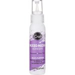
There are a couple of things to keep in mind when working with gel mediums. One is that the drying time will be influenced by environmental factors. I don't like to dry molding paste with a heat tool because it seems more prone to cracking. When I lived in Arizona, things dried far faster than where I live now - which is in Portland, Oregon. Except in the summertime, when it is quite dry. Additionally, if you are going to color the medium, and consistency of color is important, try to make enough of the paste at one time. It is difficult to replicate an exact match. This isn't usually a problem because 'close enough' is usually good enough, but it will depend on your project and the effect you are after. Also, the best adhesive for adhering items to the dried paste is one that offers good adhesion without breaking down the textured surface. I find that iCraft Mixed Media Adhesive works well.


This last card uses the same grid stencil and Mega Love die cut from another marbled background. But because ink blending was used to make the background, it gave a very different look. To achieve the rainbow effect, I used pink, yellow, and blue ink and overlapped them to create secondary orange and green colors. This is super easy to do. Mixing colors on paper is a fast and effective way to achieve more interest when ink blending.

If making cards for others is something that brings you joy, I hope that you consider trying one of these techniques on your next project. Cheers.


THIS POST MAY CONTAIN AFFILIATE LINKS. BY CLICKING ON THEM AND PURCHASING PRODUCTS THROUGH MY LINKS, I RECEIVE A SMALL COMMISSION FOR THE REFERRAL. THE ITEM WILL NOT COST YOU ANY MORE BY GOING THROUGH THIS LINK.

Wednesday, May 3, 2023

Polychromatic Watercolor Layers on Cards


There have been many blog posts here about watercolors and cardmaking. However, they usually discuss specific media and techniques to achieve pleasing results. Today's post is a little different because the focus is on polychromatic watercolor layers on cards. Polychromatic means multiple colors. The inspiration for this card and a variation of this technique is from the Altenew Academy course: Polychromatic. 

Steps for background:

Scribble watercolor pencils on watercolor paper
Spritz with water
Move paint and water with a paintbrush
Let Dry
Scribble a little more watercolor pencil onto paper
Spritz with water
Move paint and water with a paintbrush
Let Dry
Randomly stamp floral outline image from Altenew's Build-a-Flower: Primrose set with Versamark
Heat emboss with a thick, clear embossing powder such as Amazing Glaze
Roughly color the stamped/embossed images with watercolor pencils
Wet the images with a thin watercolor brush or refillable watercolor brush
Let Dry
Touch up the images with additional color if needed
Cut panel with the smaller rectangle of the Master Layouts die cutting set from Gina K. Designs
Glue to a piece of teal blue cardstock that was cut with the larger rectangle die from the same Master Layouts set
Glue fun foam to the back of the layered panel and adhere to a top-folding A4 card base


Steps for Sentiment Strip:

Cut a piece of cardstock at least 4" x 13/16"  or cut it to that size after stamping and embossing
Treat with anti-static powder
Stamp sentiment - this is three separate stamps from the same Primrose set
Heat emboss with white embossing powder
Adhere foam tape to the back and pop it up onto the background piece which has already been attached to the card base

Steps for Blue Floral Images:

Stamp floral outline image from Altenew's Build-a-Flower: Primrose set with Versamark onto watercolor paper
Heat emboss with gold embossing powder
Roughly color the stamped/embossed images with watercolor pencils
Wet the images with a thin watercolor brush or refillable watercolor brush
Let Dry
Touch up the images with additional color if needed
Let Dry
Die cut images
Pop-up flowers with foam tape, one or two layers depending on the desired depth
Dot the centers of the flowers with a white gel pen or white paint

I like that there is a lot of depth and texture to the water coloring on this card. It also works well because of the high contrast in colors on the card. Please let me know if you enjoy using watercolors, too. Have a wonderful day!

THIS POST MAY CONTAIN AFFILIATE LINKS. BY CLICKING ON THEM AND PURCHASING PRODUCTS THROUGH MY LINKS, I RECEIVE A SMALL COMMISSION FOR THE REFERRAL. THE ITEM WILL NOT COST YOU ANY MORE BY GOING THROUGH THIS LINK.