Paper and Fiber Arts


Welcome to my mixed media blog. Thanks for stopping by.
Showing posts with label Reinkers. Show all posts

Thursday, April 27, 2023

Creative Watercolor Media Card Made with Re-inkers


Creating a Watercolor Card with Re-inkers

The latest AECP class that I completed is the Creative Watercolor Media course in Level 2. There are many different ways to achieve a watercolor effect. Watercolors come in many forms: liquid, pan, pencil, crayon, dots, tubes, and sticks. However, this class is all about using ink with water to create a watercolor look without actually using watercolors. Just as pigment intensity varies with true watercolors, the pigment load exhibited in inks varies, too. The card pictured here is made with water-based dye inks from re-inker bottles. The more diluted the ink, the more transparent the painted image. But first, let us talk about the necessary supplies to work with re-inkers in this manner.

Paper Matters

There are many watercolor papers available. The kind that I used for this card is from Fabriano. It is 300 gsm, 140 lb, and comes in a 9 x 12 pad of 60 sheets. I mainly use it because it is more economical than many of the other papers I've used in the past. It does have the typical watercolor slightly-bumpy paper texture. This makes it challenging to achieve a crisp stamped image. Because these images were to be heat embossed with gold embossing powder, I wasn't very concerned about the texture of the paper. Using a stamping platform and double stamping with Versamark helps to ensure a good enough base for the powder to stick. I also made a background with re-inkers on the same paper as the stamped and die-cut images.

Creating a Background

The background was made by dropping dots of Burnt Red, Marigold, and Citrus Burst dye ink re-inkers onto wet watercolor paper, and then using a straw to blow air across the page. I also used a pipette to see if the same effect would be achieved. The pipette didn't work well because there was not enough air to move the water and ink. It came in handy to add more water, though. As it turned out, it is good that the background was never going to be the primary focus because the results were different from what I had hoped. The ink dots were too saturated and created blobs. Next time, I will mix the re-inker dots with water before applying the ink to the paper. 

After the background dried, I splattered some opaque white watercolor (Dr. Ph Martin's) and some gold metallic watercolor (Altenew's) over the paper. 

Painting the Stamped Images

Because of all of the little wells, using a mixed media mat made it easier to mix the ink with water. This also allowed for lots of surface area to dilute the ink even further. The picture above shows the four blue inks: Sea Breeze, Turquoise, Tide Blue, and Starlight, along with the green Firefly ink prior to mixing with water. I used a wet-on-wet technique which moves the ink and water on the images really easily. This is something that takes practice. Some of the flowers and leaves look better than others! The painterly effect of ink with water is always fun to behold. I like the contrast of the warm-colored background with the cool-colored flowers and leaves. To give depth to the card the blossoms are popped up with foam tape. The sentiment strip was laying on my desk leftover from another project. It fit perfectly.

THIS POST MAY CONTAIN AFFILIATE LINKS. BY CLICKING ON THEM AND PURCHASING PRODUCTS THROUGH MY LINKS, I RECEIVE A SMALL COMMISSION FOR THE REFERRAL. THE ITEM WILL NOT COST YOU ANY MORE BY GOING THROUGH THIS LINK.

Thursday, March 16, 2023

AECP Easy Die Cutting Techniques


Hello! Today's post is inspired by the Altenew Academy's Easy Die Cutting Techniques course taught by Yana Smakula. The last two blog posts also included die-cutting elements but this one will show an additional way to use die cuts. 


Inlaid die cut and popped up die cut in white

Inlaid Die Cuts

This is a fun way to expand your die cuts, especially background or cover plate dies. You can vary the inlay depth by choosing to pop up the negative cuts or inlay them like tilework. 


The first card is watercolor paper painted with reinkers. I have a lot of reinkers! And this is another way to use products from my stash. The colors used are mainly discontinued Close To My Heart colors and a couple of PinkFresh Studio ones, as well. The white cube pieces are glued on top of the watercolored pieces and reinserted into the cover die-cut piece. I wanted the 'love' to show up well, so underneath the word are the original pieces placed back into the die.
Radial Hearts Cover Die Inlaid Technique

The base layer of this card is die-cut with all of the pieces replaced. After adhering them into place, I ink-blended the base.  Cutting the teal paper with the die allowed a lot of flexibility in how many pieces to use to adhere on top of the base. It also allowed for three of the hearts to be glued onto the top of the circle around the sentiment. The card base could have been made by embossing the die cut instead of cutting out the base layer. I rarely pre-plan my cards and layouts so that did not occur to me until the card was almost completed.


Inlaid die-cutting
The "love" circle is part of a set from Taylored Expressions. The circle part is cut from the word on the liquid watercolor/reinker card.


THIS POST MAY CONTAIN AFFILIATE LINKS. BY CLICKING ON THEM AND PURCHASING PRODUCTS THROUGH MY LINKS, I RECEIVE A SMALL COMMISSION FOR THE REFERRAL. THE ITEM WILL NOT COST YOU ANY MORE BY GOING THROUGH THIS LINK.


Products Used:


Thursday, May 9, 2019

8 One-Layer Cards with Altenew's Multi-Layering Stamps

A lot of pictures in this post!
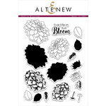
Have you used stamps that are designed to be layered on top of another?  These sets create interest, depth, and color in a quick and easy manner. I bought a few Altenew stamp sets a couple of years ago that I was never able to use. That is because shortly after they arrived, my crafting stuff went into storage for our move and subsequent remodel.  Yesterday was the first time I have been able to stamp (I KNOW!) in over a year and a half!  I chose Altenew's Dahlia Blossoms set to break the stamping-drought. It is such a lovely set and I wanted to create interesting, mailable cards to give to my mother. The 8 one-layer cards are as flat as can be and yet still offer visual interest through Altenew's multi-layered designs.
Altenew Green Fields Ink Set with Dahlia Blossoms


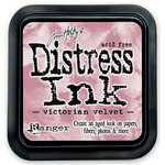
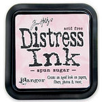
One of the questions I had about using these stamps was, "Would the ink I already own work with these stamps?"  Obviously, Altenew's ink would be great, but I only had one set of their ink pads. I didn't want all of the flowers to be shades of green, which is the set I bought a long time ago.  The other concern was how well they would have held up to storage in Arizona's heat and subsequently in all of the seasons in Oregon. I don't have the re-inkers for the 4 colors in the set. With a little trepidation, I opened the pads.  They were in good shape!

CTMH and Distress Inks with Altenew Stamps
The exact colors and inks are listed below for the products that are still available.  Some of the Close To My Heart inks are retired, so they are not listed. The non-Altenew sentiments are from retired CTMH stamp sets.
Distress Ink, CTMH, and Altenew Inks

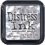
Tim Holtz Distress Ink with Altenew Stamps
The card above has two types of silver tape on it.  This will not cost any additional postage because it doesn't add bulk or noticeable weight to the card.  After blending Weathered Wood ink around the edges, I splattered it with water droplets.
Layered stamping without the solid layer for Dahlias

3-layers of stamping surrounded by outline stamped images

CTMH inks with Sakura Glaze penned frame
The card above has a 3/4" white border around the stamped flowers.  This was masked with post-it notes prior to stamping.
Black ink is Altenew with watercolor pencils and Sakura ink on top
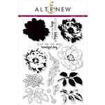
 The sentiment, "Sending hugs and happy thoughts" is from Altenew's Beautiful Day stamp set
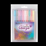
Yellows are Distress Inks with Sakura Black Glaze pen outlined over the stamped image

All of the inks worked with the stamps. However, the solid images had some bubbling/pitting with all of the inks except for the Altenew. On the list for another day of study/play will be to try the solid images with some other types of ink.  I used Stampin Up! inks to start with and didn't love the results, so I moved on to the CTMH and Distress Inks.
Gelly Roll over stamped text
The one thing that gives some of the cards a little bit of pop and sparkle is Sakura's clear Stardust Gelly Roll pen. It is the easiest thing to use to add a bit of ooh la la to any project.
Gelly Roll randomly highlighting stamped image

This stamp set has a coordinating thin-die set.  Since the cards are all flat, I didn't need to cut any stamped images for them. But, using the dies to cut out masks from Post-It notes made it an easy and fast way to create lots of masks.  I store the leftover masks in the package with the stamps.
Use dies to cut on the sticky part for masks

Store leftover masks with stamps
It was great to get back to crafting!  Next time, I hope to have located my acrylic blocks or MISTI. It would have made things a wee bit easier!  But, as the saying goes, "When there is a will, there is a way." It was time to get back to doing something I love and, more importantly, make something from my heart for my mom.  Thanks for stopping by today!
Supplies:

Monday, January 20, 2014

Ombre Effect on Paper and Artbooking Made Easy: Love, Love, Love

Christine from CTMH shows two cute mini books in this video that were made with the Cricut Artbooking cartridge.  But, I think the best part of the video is the two techniques using reinkers on paper. Learn how to create cool paint splotches and the ombre effect with just water, a sponge dauber and reinker.
Please contact me with any questions!
Beverly

Friday, August 9, 2013

Ombre Technique Using Reinkers

This video presented by Close To My Heart shows a fun and easy way to get beautiful colors using reinkers and Liquid Glass.

If you have any questions please leave me a comment or email me.
Thanks!
Beverly

Tuesday, August 28, 2012

Polished Stone Technique - CTMH Inks

CTMH Thanks Stamped with CTMH Black Archival Ink
 Background Technique Week continues with a third variation of the Polished Stone Technique.  Here is a video recap of the different materials and a quick demonstration of the technique using cotton balls and CTMH reinkers:


The reason why glossy paper works well for this technique is that the liquid needs to stay on top of the paper for as long as possible so that it can be moved around.  Some applicators work better than others for dispersing the ink and blending solutions. One of my favorites is cotton balls because they hold the liquid well and are inexpensive.  You can also try sponges, rags, q-tips and see what works best for you.  With the other applicators you may get a different look than polished stone, but it can still be pretty spectacular in appearance.
Polished Stone Technique with CTMH Juniper, Sky and Lagoon Reinkers
I tried using the silver metallic marker from CTMH on the piece above and discovered that the ink would not blend.  Good to know that it is a great medium for a permanent application.

Hambly Studios Washi Tape Toned Down the Intensity of the Pink Cardstock
The last picture is to show that the washi tape really changed the tone of the front.  The pink of the cardstock  is very bright.  Depending on the recipient, it may need a neutral mat added to the inside for the message and signature.

Thursday, July 26, 2012

La Belle Vie Gift Box and Card

5 Inch Tall Box With Card Under Bow
This gorgeous paper is perfect for so many beautiful projects; it is hard to choose just one to make.  As it turned out, making a box, an envelope and a card took care of the dilemma of having to decide on only one thing.  Starting in August, CTMH is adding some temporary cardstock colors with the new B & T paper packets.  Two of the colors, La Belle Vie Mauve and La Belle Vie Pink, are exclusive to the the La Belle Vie packet.  I used one of the new exclusive colors from this packet for the top and bottom of the box.
Petal Card and Envelope Cut at 4 Inches
There are three different double-sided patterned papers in the packet.  I love using double-sided papers for envelopes. The inside of the card has a 2 inch Bamboo cardstock scallop circle layered inside for a small message and signature.  This makes a perfect gift-enclosure sized card.  I stamped the bee from the Jardin set onto the patterned paper with Smokey Plum ink for the envelope.

CTMH Cricut Artiste Cartridge Page 40 Card 
When making folded paper projects, it is a good idea to use a bone folder for crisp folds.  It is easy to see where to make the folds because the Cricut provides score lines/cuts. The petal card looks complicated, but it is simple to overlap the folds, which in turn holds it closed.

B & T Strip Used as Accent Around Lid
The box is on the same page of the Cricut Handbook (page 40) as the card and envelope.  The top and bottom are the same piece, so two of these are cut for this box.  After having the Cricut cut them at five inches out of plain cardstock, I random stamped them with various stamps from the Jardin set.  After assembling the lid, I adhered the accent strip from one of the patterned paper sheets around the perimeter.

Seam Binding Colored With Smokey Plum Reinker and Water
CTMH has a seam binding which can be colored with ink to match the project.  I used a piece of this and tied a bow when it dried after coloring it with re-inker mixed with a little bit of water.  The black metal bow clip is from the new Boutique Assortment. It made the perfect embellishment to decorate the seam binding bow.
CTMH Jardin Stamp Set Used on La Belle Vie Mauve Cardstock
Here is a video with some tips and suggestions about the projects posted on this page:


The new catalog will go live on August 1, 2012.  At that time, all of these products will be available!

Thank you for stopping by today!  I appreciate you spending time here.
Beverly

Saturday, July 14, 2012

Downloadable Chart of CTMH's 60 Colors

Earlier today I posted the list of retiring CTMH colors.  I thought it might be helpful to have a chart with all of the currently available colors so that people could take an "inventory" of what they have and what they want to purchase before they are discontinued.

CTMH 60 Colors Chart

Please let me know if you have any questions.

Beverly

Retiring Colors From Close To My Heart


The new Idea Book and Catalog will be released on August 1, 2012.  There are some exciting changes in the new catalog.  One of the biggest ones is that all of the current markers are going to be discontinued because CTMH will be offering alcohol based markers.

In addition to the new markers, CTMH is streamlining their cardstock and ink offerings.  There will now be 40 colors, plus Colonial White and Daisy.  Some of these 40 colors are new.  Which means there is a longish list of colors that will no longer be offered.

If you are wanting to make sure you have reinkers, markers, stamp pads or cardstock in any of the following colors for upcoming projects, now is the time to order them.  They will be available through July 31, 2012 or while supplies last.

Here is the list of retiring CTMH colors:

Grey Wool
Grey Flannel
Vanilla Cream
Parchment
Brown Bag
Baby Pink
Taffy
Sunkiss Yellow
Key Lime
Heavenly Blue
Lilac Mist
Amethyst
Holiday Red
Sunflower
Sunny Yellow
Dutch Blue
Moonstruck
Vineyard Berry
Tulip
Garden Green
Spring Iris
Petal
Garnet
Pansy Purple

To place an order, please go to my website here.

Please let me know if you have any questions.  I will be posting a list of retiring stamps next week.
Thank you for visiting!
Beverly

Friday, July 13, 2012

Christmas In July - Canvas Wall Art With Paper and Clay

Martha Stewart Craft Clay Frame Painted With Pearl Paint Mixed with Reinker
It is hard to find inexpensive, yet pretty home decor pieces.  So, I was pretty excited when I found these little stretched canvases at Jo-Ann's on sale for $.50 each!  That meant that whatever I made with them would still fall into the low-cost category. The various ribbon pieces, papers, bitty pearls and the small amount of clay cost less than $5 all together.  What a great gift this will make!

Three Small Stretched Canvases Transformed Into A Single Piece of Art
By placing the canvases on top of the chipboard and cardstock base this 3-d piece of art already has a lot of depth to it.  When adding a clay frame and popped up letters, it makes it even more interesting to look at.  There is a lot of detail with big impact on a pretty small piece.  The overall dimensions are based on the scrap piece of chipboard I used to mount the three canvases.  It is about 9" long and a little less than 5" high.  The ribbon lace across the canvases ties them together, yet still allows each one to stand as its own little creation.

Holly Leaves Cut With Art Philosophy Cricut Cartridge

Here is a video tutorial on how to make this triptych inspired Christmas art:


Thank you for visiting today!
Beverly

Supplies:
3 - 3.5" x 2.5" Stretched Canvases
Cricut Cartridge - Art Philosophy
Martha Stewart Frame Mold and Craft Clay
Paper: CTMH - Mistletoe (Retired)
Cardstock: CTMH - Cranberry, New England Ivy, Ponderosa Pine
Ink: CTMH New England Ivy, Versamark
Reinker: CTMH Parchment retiring July 31, 2012
Stamps: CTMH Baroque Alphabet retiring July 31, 2012, CTMH Diverse Backgrounds
Chipboard or Cardboard
Ribbon: Kaiser lace and (retired) CTMH
CTMH Bitty Opaques Pearl Adhesive Gems
CTMH Silver Embossing Powder
CTMH Create-A-Shade Perfect Pearl Paint
Markers: CTMH Black retiring July 31, 2012, Copic R27, R29
Adhesive: Golden Matte Medium, CTMH Liquid Glass3-D Foam Tape
Dry Embossing/Scoring Stylus
Craft Heater
Micro-Tip Scissors